The shared Superpower navbar used across LP templates. It mirrors the live site behavior: fixed positioning, desktop scroll morph into the dark blurred pill, centered logo scale, dotted hamburger control, and the right-side mobile menu.
The stripped LP nav for the PDP layout (CRO-PDP testing Figma 1SsiG9YladWmn8Xg0Z0KMl, node
248:166): wordmark, six section links, one CTA. Not the full sp-navbar3 mega-menu, and
deliberately not sticky.
Nav Logo Only
The PDP nav after the 2026-08-24 review: wordmark centered, no CTA pill. On mobile the pill ran
long enough to sit over the wordmark, and the owner asked for the button removed on both
breakpoints rather than shortened.
Each option is one responsive JSX block — desktop has wider layouts, larger headlines, and side-by-side CTAs; mobile stacks vertically with full-width buttons.
Node Inventory
Variant
Node ID
Layout
Option 1
986-5750
Two-column copy, CTA row, USP row, square media card
Option 2
7-302
Centered copy, CTA row, USP row, large media block
Option 3
7-299
Inset background-media hero, centered white content
Option 4
7-300
Inset background-media hero, left-aligned white content
Option 5
8-664
Left-aligned copy with horizontal media rail
Option 6
8-719
Centered copy with horizontal media rail
Option 7
8-807
Two-column copy and staggered media grid
Option 8
665-3574
Content/stat row with large media block below
Hero with Quote
Reference page
Quote-led doctor endorsement hero
Hero with Quote (Inverted)
Reference page
Quote hero with image left and copy right
Hero Podcast 1
Reference page
Podcast endorsement hero (quote layout, text pill, editable host image)
Hero Podcast 2 (Description)
Reference page
Podcast hero with a plain description paragraph instead of a quote
Partner mark above headline, 4:5 composite media column, centred copy
Option 1
Option 2
Option 3
Option 4
Option 5
Option 6
Option 7
Option 8
Hero with Quote
Hero with Quote (Inverted)
Partnership Hero
Hero Podcast 1
Hero Podcast 2 (Description)
Weight & Appetite Panel IncludedSave $99
Find what your weight-loss plan is missing
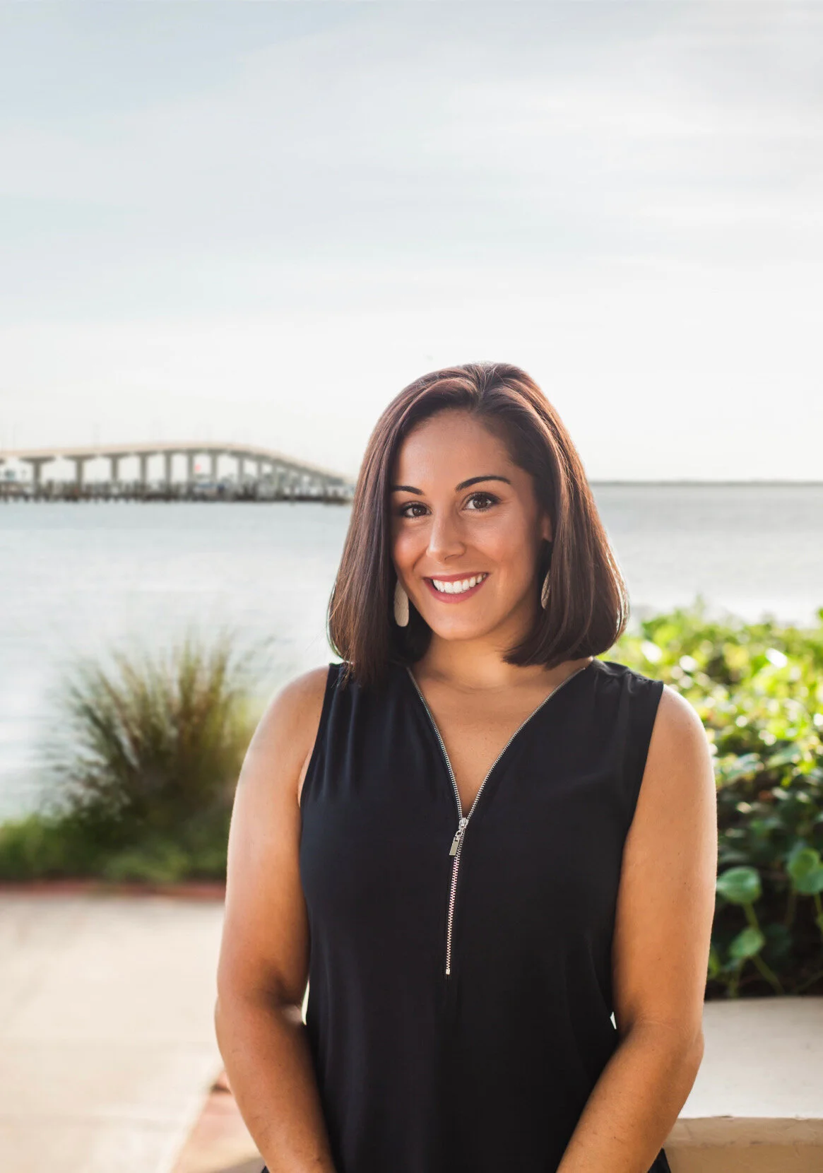
Feeling like nothing’s working? Two hormones could be making weight loss harder, and standard panels don’t test them: leptin and adiponectin. For a limited time, test both free with your Superpower membership and see what’s slowing your progress and what you can do about it.
Test 100+
biomarkers
Personalized
action plan
Finally see
progress
*Pricing may vary for members in New York and New Jersey
Hero Influencer Special
Ported 1:1 from the live wf.superpower.com/landing/steve-aokisection_sp2-home-hero.is-aoki-hero.
A near-full-viewport rounded card: background photograph, copy left, and a KPI row pinned to the
bottom. Built for portraits shot with the subject on the right and negative space on the left, which
is what keeps the headline legible.
Two background uploads. The live page ships one pre-overlaid .avif; this variant takes a
desktop image AND a mobile image, because the composition that works in landscape does not survive a
portrait crop. The markup authors them loading="lazy", but at render time the shared media policy
(live-media-policy.ts) flips hero-role images to eager, strips the img-level priority hint, and
the server emits a media-qualified high-priority head preload per crop — the viewport's crop
fetches first and at full priority; the hidden crop costs one low-priority duplicate download.
A gradient scrim sits above both so white copy stays legible on any upload — the live
Aoki asset has that gradient baked in, which a fresh upload will not.
The KPI row sits bottom left, under the copy, exactly as the reference renders it. To move it
right instead, add self-end and swap pl for pr on that row.
Ladder measured at 1512 / 900 / 700 / 390: card height 100dvh - 5.5rem with a 5.5rem top margin
on desktop, full 100dvh and no margin below 992; inner padding 4rem → 3rem → 1.5rem bottom
with the left inset dropping to 0 at ≤767 (the copy carries 1.5rem/1.25rem of its own there);
radius 0.75rem on desktop, square below 992 where it goes edge to edge.
Hero Partnerships
Built from Kevin's co-branded frame (Co-branded Landing Pages, node 1429-4082). Differs from
Partnership Hero in three ways that matter, which is why it is its own variant rather than an
edit of that one:
The partner mark stands alone above the headline at ~45px, instead of sitting in a
superpower | partner lockup at 15px. Superpower's own wordmark is carried by the navbar. A 15px
slot suits a pure wordmark like VAST's; it strands any logo that has a symbol in it (YPO's
triangle rendered 39x15 against Superpower's 151x22).
The media column is 4:5 portrait and sized larger than the copy column (624 vs 515 in the
design), for a full-bleed composite rather than a square product shot.
The copy column is vertically centred against that taller media, not stretched to match it.
The media slot takes a single composite export — the digital twin with its annotation callouts
is one flattened image, not rebuilt as DOM. Leader lines and floating value cards depend on exact
positions against the render; reproducing them in markup would drift the moment the image is
swapped, and the whole point of the slot is that partners swap it.
Hero Author / Light
The opener of the Doctor / Paid Ads layout, rebuilt against
Website-CRO → Latest
on 2026-08-22 — desktop node 398:5778 (1512 × 896), mobile 414:8016 (393 × 855). The earlier
Paid-Ads-LPs796:72 frame is history.
An editorial hero: a byline under the headline puts a named clinician's authority on the page before
anything else does. Copy left and a square media card right on desktop; on mobile the card goes
first, full-width, and the copy follows — that inversion is in the reference and it is what makes
the photograph the first thing on a paid-traffic mobile landing.
No navbar sits above this. The reference frame starts at y=0 with the hero. Pages that want one
add the minified nav section; the template does not ship a hidden one.
One upload, not two. The desktop and mobile exports were byte-for-byte the same composition at
1035 and 1408, so this hero ships the 1408 only: a 44rem box at 2× and a 345 box at 4×. That also
sidesteps a trap worth knowing — a hero rendered as two CSS-hidden crops downloads both files on
every visit, because display:none does not cancel an eager fetch and live-media-policy sets
loading="eager" on everything carrying data-lp-media-role="hero". Measured at 1.6Mbps: 175KB
fetched to paint a 100KB picture. srcset does not fix it either, because the preload emitter writes
a plain href instead of imagesrcset, so the preload and the srcset pick different candidates.
The media card is a baked composite. The reference layers dashboard cards between two copies of
the photograph (so the cards read as behind her) and then sets the Clinicians' Choice lockup over
the bottom. All of it is one upload per breakpoint — replacing either file loses the dashboard cards
and the lockup, so re-export 409:7140 / 414:8752 instead of swapping in a bare photo. The card is
square at both breakpoints (704 desktop, 345 mobile), which is why there is no aspect switch.
Measured ladder: section padding 1.6875rem / 1.5rem block on mobile → 6rem at 992; copy column
32.1875rem (515) against a 44rem (704) card, justify-between inside the 80rem container;
child gap 1rem → 1.5rem. Type steps 40/42 → 60/64 on the headline and 16/22 → 20/28 on the body,
whose colour is the reference's literal #52525b. The body is capped at 29.4375rem (471) because
the reference sets it narrower than the column it sits in.
Deleting any row is safe: the copy column spaces its children with gap, never margins, so removing
the rating line, the byline or the paragraph closes the space instead of leaving a hole.
Want the warm version? Pick Hero Author / Tinted below instead — it is a sibling variant, not
a toggle on this one, because the two need different assets.
Hero Author / Tinted
The warm sibling of Hero Author / Light. Ported 1:1 from Figma
Hero_V2 — 798:1446.
Why a variant, not a toggle.
The first pass shipped this as a page-level add-on (addOns.heroTint) that recoloured the light
hero. Gabriel, 2026-08-07: it belongs to choosing this hero, not to the page. It is also not a
recolour — the two heroes need different assets:
Hero Author
Hero Author (Tinted)
Background
white → grey gradient
a measured five-stop warm gradient
Portrait
studio shot, in a rounded card
cut-out with alpha, standing on the gradient
Copy
text-foreground / text-secondary
white, eyebrow at 70%, date at 50%
CTA
black pill
white pill, dark label
Rating line
avatar cluster, text-secondary copy
same cluster, white rings + text-white/70 copy
Recolouring could never get there: the light hero's portrait carries its own pale studio backdrop,
which reads as a panel floating on the tint rather than a subject standing in it. That was the visible
defect in the add-on version.
The gradient is five measured stops of CSS, not an image. The reference composes it from a peach
texture plus a rotated mix-blend-darken shape — the first pass shipped only the texture and came out
visibly pinker and flatter, because all the depth lives in the blended layer. Sampling the composed
result at six points and fitting one 107° ramp lands the same colour, weighs nothing, and means
retinting the hero is a five-value edit rather than a new asset.
Not full-bleed on purpose. Kev asked to move the clinician pages off the Influencer Special
card. The portrait sits LEFT in its own rounded card with a name + credential caption pinned to
its bottom-left corner; the copy sits RIGHT: member rating line, H1, three check rows, one CTA.
No subhead. The section ships no nav of its own, it goes directly under the regular Navbar section.
Measured ladder at 1512: card 732 × 885 inset 8px, radius 12; copy column 560 starting 96px
after the card and vertically centred; caption inset 24 at 24/32. Below 992 the card becomes a
full-width square (8px inset), the caption drops to 18/24 inset 12, and the copy stacks at 24px
side padding with a 40/42 headline and a full-width CTA. Both breakpoints crop ONE upload with
object-cover, so a portrait export works for both.
Reveal runtime LAST so no sibling index moves (slot paths are positional). Fold cap (2026-09-15,
Gabriel: the hero ran past 100vh on desktop): Kev's 732×885 card plus the nav is 965px, taller than
a 900px laptop viewport, so at 992+ the card keeps its 48.93% column (the split screen) and is
h-[calc(100dvh - 5.5rem)] (nav 80px + the 8px inset) with aspect-auto, so hero + nav fill the
first screen exactly on every desktop height and the portrait crops top/bottom to fit (a shrunk
card left the copy floating left, and the earlier 885px cap left a gap under short heroes on tall
screens; Gabriel 2026-09-15). At 100dvh = 973 it is pixel-for-pixel Kev's frame. Same paragraph on purpose:
a new block before the toggle shifts the document index every slot path starts with.
Hero Clinician (Subhead)
Kev's clinician hero, second pass (2026-09-15, Kayla Barnes-Lentz + Sara Szal sign-off round).
Same card-left / copy-right anatomy as Hero Clinician above, with the one addition Connor and
DQ drew into the Figma copy pass: a 24/32 subhead between the H1 and the check rows
(Hero_Option 1 — 1108:1255).
Appended as its own variant so the four saved clinician pages on Hero Clinician keep their
slot paths (an inserted sibling would have shifted every check-row and CTA edit).
The portrait carries an explicit sizes (48.93vw on desktop, full width below 992) so the
optimizer's srcset lands on the 2× of the rendered card instead of a 100vw guess.
Hero Clinician (Frame 09-17)
Kev's clinician hero redrawn 2026-09-17 on all four frames (Ashley 1121:1941, Sara 1175:632). Three changes from Hero Clinician (Subhead), which is why this is appended rather than edited — #19 is live on /lp/kayla-barnes and every saved edit there is keyed to its slot paths. (1) The columns swap: copy left, portrait right. DOM order is unchanged — the portrait is still the first child, so mobile keeps image-over-copy — and min-[62rem]:flex-row-reverse does the swap; with the same 48.93% / 35rem / 6rem gap that reproduces Kev's geometry exactly (portrait 732 wide ending 8px off the right edge, copy starting at x=116 on his 1512 frame). (2) The name chip leaves the portrait and becomes a 48px round avatar + name + "Updated on 9/2026" directly under the H1 (1438:4934); the three check rows stay in the markup under the subhead for pages that still want them, hidden per page with a hide edit. (3) A badge bar (1438:4902, 686×167, inset 23px from the portrait's bottom corners) sits over the photo — bg-black/16 + backdrop-blur-[2.25rem] is a real blur over the portrait, not a baked gradient, so the freshly baked portrait stays its own layer. EVERY measure inside it — the 23px inset off the card, the 28px padding, the 44.036px/21.719px type, the 258px seal, the 73px gutter — is a cqw fraction of the card (@container), because the card is a fixed fraction of the viewport: at 992 it is 479px wide and a fixed 44px "100+ Clinicians" would overflow the bar. The inset has to be cqw too, not inset-x-6: a fixed inset eats a bigger share of a small card, which squeezed the flexible text column harder than the type shrank and wrapped the headline at 992. The laurel seal is Kev's artwork exported whole (/lp-assets/clinicians-choice-seal-e075c9.svg, node 1438:4907 with the Figma page background stripped) and is deliberately NOT a slot — never rebuild the wreath by hand. Fold cap as on #18/#19: h-[calc(100dvh-5.5rem)] on the portrait at 992+, so hero + nav fill the first screen exactly and the portrait crops top/bottom instead of the column shrinking. One deliberate difference from #19: the copy column is NOT shrink-0. Between 992 and ~1100 the 48.93% card + 6rem gap + 35rem copy is wider than the row, and a shrink-0 copy column is pushed out of the row — to the left here, where flex-row-reverse puts the overflow, so the headline would be cut off by the section's overflow-hidden. Letting it shrink costs nothing above ~1100 (there is 108px of slack at 1512, so the column still measures 560 and still starts at x=116) and keeps the text on screen below it.
Hero Symptom Tags
Kev's women's symptom listicle hero (2026-09-25, desktop 2300:9890, mobile 2290:2840). Copy left, photo right, and seven glass symptom tags over the photo instead of #20's badge bar. The photo is its own layer (the Figma rectangle 2300:9892 exported at 2x) and every tag is live text, so a page can rename a symptom without a re-export. The card sits flush under the nav and 8px off the right edge exactly as drawn (calc(50% - 1.5rem) wide, 732 at 1512), with the same fold cap as #18–#20: its height is Kev's 885/732 ratio but never more than 100dvh minus the nav, so hero + nav fit the first screen and the photo crops instead. Tags are positioned in % of the card (mobile values from the 377² frame, desktop from the 732×885 card) and sized in cqw, so they scale with the card: 56/732 tall on desktop, 28/377 on mobile, the same 7.6% either way. On mobile the card is square with 8px side margins and the copy sits under it. Kev's 09-28 round moved the three trust badges into the hero, under the CTA (left-aligned on desktop, centred on mobile), so pages on this variant drop the separate LP Badges section.
Hero Clinician (Wide Copy)
Hero Clinician (Frame 09-17) with a 35rem copy column instead of 32.1875rem, so a two-word
line like "recommends Superpower" (544px at 48px) stays on one row (Sara Szal, 2026-10-01: the
type size stays, the portrait gives way). The portrait is min(40rem, row - 37rem) wide and square,
so the 35rem column plus a 2rem gap always fit: 640 at 1440+, 608 at 1280. Same DOM as #20, so a page
swaps between the two without losing a single edit.
Hero Partner Tint
Port of the Webflow co-branded hero on superpower.com/sequoia (also /alliantpnw, /transformation-capital):
a rounded full-width card over a wave photo, superpower | partner lockup, gradient headline, white pill CTA
and a tablet render bleeding off the bottom. The partner logo is a slot. The card's colour comes from the
page's heroTint add-on: applyLiveHeroTint derives four tones from one picked colour and stamps them as
--lp-hero-tint-* on [data-lp-hero-tint]; unset, every var falls back to the Sequoia green.
Hero Superpower Tint (No Logo)
Hero Partner Tint without the partner: Superpower's wordmark alone and a fixed graphite card, for
partners whose logo or colour does not hold up on the photo (Renee, 2026-10-07: "no client logo at all,
just superpower and fixed background"). Not wired to the heroTint add-on on purpose. Same DOM as #23
minus the divider and logo, so the copy slots line up for editors.
Hero Symptom List (Cutout)
Alex's hero image test arm for the women's symptom listicle (2026-10-08, Figma 2593:14884, "Hero image B · older woman"). Same copy column and DOM as #21, so a page swaps between the two without losing an edit; only the photo card differs. Instead of #21's glass tags the seven symptoms run down the left as a list (the active one full white, the rest at 60/40%) beside a tick ruler, and the subject is a cutout of the same photo laid OVER the list, so the words pass behind her head. Three layers, never flattened: background photo, list + ruler, cutout. The photo is width-fit with object-top everywhere and the list is placed in cqw, so it stays registered to her head at any card height; on mobile the square card crops the bottom of the shirt.
Ten independent feature sections. Each is one responsive JSX block — desktop and mobile share the same content (same number of steps, same copy, same icons), only the layout reflows.
Node Inventory
Variant
Node ID
Notes
Feature V1
666-135
4-card numbered "How it works" layout
Feature V2
666-885
Membership value section, rating badge, quote, and 4 feature rows
Feature V3
Live page
Dr. Connealy lab-results sticky price + 5 step rows
Feature V4
779-79
Heart-guideline banner: pretitle + 3 stat columns
Feature V5
667-1514
"See your health" with phone mockup
Feature V6
667-1540
Vetting criteria with branded product image
Feature V7
770-52
"From draw to plan in days" with 4 numbered step rows
Feature V8
Webflow
Fathers Day health changes drag slider
Feature V9
Webflow
VAST "How Superpower Works" four-card section
Feature V10
Webflow
VAST partnership claim gift section
Feature V1
How it works
It starts with an advanced health check, then so much more.
1
Test your baseline
One simple blood draw to measure 100+ biomarkers.
2
Results explained
Get a complete picture of your health data in one secure location.
3
Build your protocol
AI builds evidence-backed protocols, informed by your data.
4
Access everything
Take action and access everything you need. You're in control.
Feature V2
Feature V3
Feature V4
Feature V5
Feature V6
Feature V7
Feature V8
Feature V9
Feature V10
Feature V9 (Benefit)
Feature V9 for covered-benefit pages, as on superpower.com/sequoia: "What you get", 100+ biomarkers (the
B2B baseline, see the B2B rules) and an "Activate benefit" CTA. V9 itself stays 150+ for the consumer
pages that use it.
Feature V10 (Benefit)
The superpower.com/sequoia "Complimentary access" block: no eyebrow, the not-covered line, the $10,000
value line and three bullets. [Company] marks every spot an editor must rename.
Seven families of trust-building sections. Each is one responsive JSX block; the toggle resizes the preview frame so you can see desktop and mobile renderings of the same code.
Three member quotes side by side on desktop, one at a time on mobile, with the prev/next buttons
centred underneath. Round portrait, centred quote, name and role — no card, no border, just the
column on the page background.
Runs on the same MemberStoryCarousel as the story-02 payload rather than a third carousel
implementation: that component takes slidesPerView={3} for the three-up row and
arrows="below" to move its buttons out from over the slide.
"I've struggled with weight throughout my life. Before Superpower, I felt helpless...I was tired. My appetite was way up. Now I have a hold on things and can feel a big difference."
Bethany, 40
Superpower member
"I felt crazy because I was doing all these things and it wasn't working...my weight was climbing and it just I knew that wasn't right. Now I have answers and I'm full for the first time in years."
TJ, 36
Superpower member
“I spent a year thinking something was wrong with me. Turns out, the answer was in my blood. Within two weeks of starting my action plan, my bloating was down and I lost weight easily."
Carissa, 38
Superpower member
Review Widget
The PDP v2 member-review widget (CRO-PDP testing Figma 1SsiG9YladWmn8Xg0Z0KMl, node 104:2),
on the Mars pattern: a score summary (4.5 + stars + "Based on 350+ reviews on Trustpilot") with a
"Read all reviews" action, then a STATIC grid of review cards — no marquee, no rating-distribution
bars (we don't have the real distribution, and this page has been burned by invented numbers).
All six reviews are real: three from Kevin's strawman (Mindi, HL, Anastacia Drake) and three from
superpower.com/reviews (Allison B, Coltin R, Pete H) — that page carries ~94 real member reviews
and is the source to pull from when this widget needs more. Anastacia's card uses her real
ReviewerPhoto; the others use initials circles, never a stock face.
Doctors Dark Carousel
The dark "built by the world's leading doctors" band (CRO-PDP testing Figma
1SsiG9YladWmn8Xg0Z0KMl, node 273:2520). Reuses CliniciansSlider in its dark tone: a draggable
rail of horizontal doctor cards (portrait, institution mark, name, role, one-line bio, Learn more)
on a near-black ground.
Member Stories
The PDP v4 "Real people, real stories" band (CRO-PDP testing Figma 1SsiG9YladWmn8Xg0Z0KMl, node
273:2870): centered eyebrow, headline and Trustpilot proof line, then a three-up carousel of the
Figma's six VIDEO testimonial cards — poster with a play affordance, the quote below, and an
avatar / name / "Superpower Member" / Re-tested-pill footer. Posters are stills for now (video
sourcing is Gabriel's call); the play button is the Figma affordance.
Doctors V1 Gradient
Doctors V1 on the Website-CRO gradient ground (Figma PCYluUeBYOyEFgaSo0mdW2, node 309:4162):
identical layout and slider, near-black #212121 base with the warm radial glow rising from the
bottom, white heading, dark-tone cards. Literally Doctors V1 + the gradient.
Used By Carousel
A draggable rail of mixed cards — celebrity photo, press quotes (Yahoo, Forbes, Athletech),
member app screenshot, and two creator video cards that play inline from the Superpower CDN.
Cards are plain markup (builder-editable); UsedBySlider owns drag/wheel/snap.
The lockup follows Website-CRO → Latest → 309:4295: centred "What members say about
Superpower", a "Read all reviews" pill, then the rail, then the inline Trustpilot proof row.
(It began as a clone of superpower.com's left-aligned "Used by athletes, doctors…" band.) The
reference also draws three Trustpilot review cards below this row — those are not here,
because the PDP carries the Review Widget (#9) for that and the owner moved it below the
membership section on 2026-08-24. Add Trustpilot Review Cards (#14) if both are wanted.
Three Trustpilot review cards side by side on desktop, one at a time on mobile, prev/next centred
underneath. Card is #fafafa at radius 12 with 24 of padding, the five-star row on top, then the
review title, the body, and the reviewer — content top-aligned inside a 296 floor, which is what
gives the row its even bottom edge while a longer review is still free to grow past it.
Not Quote Carousel (#8) with a new skin. That variant is round portraits over centred quotes
and it is live on two published pages, so this is its own entry. Both run the same
MemberStoryCarousel engine — slidesPerView={3} and arrows="below", which already lands the
reference's 48px buttons, their 8px gap and its 64px stand-off.
The 16px inter-card gap is a negative margin, not a gap.basis-1/3 resolves against the
track, so widening the track by exactly one gap (-mr-4) and paying it back as slide padding
(pr-4) gives 416-wide cards inside a 1280 container with the last one flush right. A plain gap
would push the third card out of the viewport.
Two of the three reviewers have no photograph on Trustpilot, so they get an initials disc — never a
stock face on a real person's review.
Reviews (White)
Kev Tang, 2026-09-17: Reviews and the comparison table both sat on the same grey, so the two
bands ran together. Same markup and slot structure as Reviews (#5) — only the two colours swap:
the section is white and the cards carry the grey.
Doctors V1 (Tight)
#1 with density="tight": 1rem of mobile block padding instead of 3rem, desktop untouched.
Appended 2026-09-18 for the clinician listicles, whose sections are capped at 2rem apart on
phones (Gabriel). #1 is on 100+ live pages, so it keeps its own spacing.
Video Testimonials (Tight)
#3 with 1rem of mobile block padding instead of 4rem, desktop untouched. Same reason, same
date, same rule: #3 is on 50+ live pages, so the tight copy is a separate variant and the DOM
below the section root is identical — a page swapped from #3 keeps every stored card edit.
Reviews (Rated)
Kev's reviews band on the women's symptom listicle (2026-09-28, 2321:3179): Reviews (White) re-cut to his frame — a rating line over the heading, the five reviews he chose for the page (hormones, dismissed-by-doctors, cost), boxed Trustpilot stars, 48px avatars and his type (18/26 title, 16/24 body; 16/22 and 14/21 on mobile). New variant rather than an edit to #15 because #15 is live on the clinician pages. The rating line reads "Trustpilot" where the frame says "260+ reviews": the count had no source when this shipped, and the 4.5 is the verified score. Initials avatars carry their colour in the markup (not a slot); the one photo avatar is a normal image slot.
Symptoms Slider
Ported 1:1 from the live /welcome-v3section_symptoms. Same horizontal slider engine as
How Superpower Works, with tighter card spacing and symptom→biomarker cards.
Symptoms Slider
What standard bloodwork isn't showing you
Fatigue
Could be thyroid, iron, B12, Vitamin D, or low cortisol — most physicals run none of these together.
Biomarkers to test
Free T3 + reverse T3
Ferritin
B12
Vitamin D
Weight change
Could be thyroid drift, insulin resistance starting, or sex-hormone imbalance.
Biomarkers to test
Full thyroid panel
Fasting insulin
Estradiol
Progesterone
Mood swings
Could be cortisol patterns, progesterone, or B-vitamin status — not always serotonin.
Biomarkers to test
Cortisol
Progesterone
DHEA-S
B-complex
Brain fog
Could be inflammation, thyroid, B12, or perimenopause hormone shifts.
Biomarkers to test
hs-CRP
Free T3
B12
Estradiol
Irregular or painful cycles
Could be PCOS markers, thyroid, or sex-hormone imbalance.
Biomarkers to test
LH/FSH ratio
Free testosterone
SHBG
Thyroid
Low libido
Could be testosterone (yes, women need it too), thyroid, or iron stores.
One blood draw. The solution you've been looking for.
Most doctors check your cholesterol and thyroid and call it a day. If you're struggling with hunger or stubborn weight, leptin and adiponectin are often the missing piece.
Dr. Leigh Erin Connealy, MD
Clinician & Founder of The Centre for New Medicine
Recommended by Dr. Leigh Erin Connealy — one of the most recognized integrative medicine physicians in the country. This panel is built for anyone who wants a deeper look at thyroid function, hormonal balance, and metabolic health.
Why take the test?
Most standard checkups skip these markers entirely. This panel uncovers hidden imbalances in your thyroid, reproductive hormones, and insulin levels, the kind of issues that silently affect your energy, weight, mood, and long-term health.
Same component as the bar above — the only differences are content: the clinician's round avatar in
place of the product shot, and the offer restated as Free: Dr. Connealy's 8 bonus markers /
Auto-applied when you join through this page.
imageSrc and imageRounded are new optional props; the default bar passes neither and renders
byte-identically.
Scroll Offer Modal
The Grüns-style once-per-session offer interstitial, built for the PDP recipe. The modal markup
lives HERE in the section (every string is a normal builder text slot, the image a normal image
slot); ScrollOfferModalPreview (appended last) owns the trigger and presentation state.
On live pages the overlay ships closed (SSR final state — the section is invisible and
zero-height) and opens once per session (sessionStorage) when the visitor scrolls past ~45% of
the page or, on hover-capable devices, moves the pointer out through the top of the viewport.
Dismiss via the X, the backdrop, or Escape; reduced motion drops the transitions. In the builder
editor canvas (static preview runtime) the driver never runs and the stylesheet re-flows the
overlay as an open in-page band, so everything is visible and editable there.
The default image is a relative /lp-assets/... URL: it resolves on every LP host AND in the
builder canvas (dev serves content/lp-assets directly; the deployed builder rewrites
/lp-assets/* to the lp-server origin — an asset only 404s remotely until its content commit is
pushed). In interactive design-gallery previews the section renders as an empty band (the modal
is closed until its trigger fires); use the builder canvas to see it open.
Biomarker Modal
The PDP's "What the 100+ panel measures" dialog (CRO-PDP testing Figma 1SsiG9YladWmn8Xg0Z0KMl,
node 133:2, holder 47:2). The modal markup lives HERE in the section — every category name,
count, marker line and the CTA are normal builder slots; PdpBiomarkerModalPreview (appended
last) owns the trigger and presentation state.
On live pages the overlay ships closed (SSR final state — invisible and zero-height) and opens
on any click of a data-pdp-biomarker-modal-trigger element anywhere on the page — the buy box's
"+N more" chips and the brand band's "See all 100+ biomarkers" CTA both carry it. Re-openable (it
is reference material, not an interstitial); dismiss via the X, the backdrop, or Escape. In the
builder editor canvas the stylesheet re-flows it as an open in-page band for editing.
The categories, counts and marker lists are the library's real ones (biomarkers.mdx — Heart
& Vascular 17 · Liver 13 · Kidney 9 · Sex Hormones 8 · Nutrients 19 · Thyroid 4, selections
shown). Never retype or invent a clinical number; the honest "a selection is shown" note carries
the partial lists.
Fullscreen Offer Modal
The PDP's full-screen scroll / exit-intent interstitial (CRO-PDP testing Figma
1SsiG9YladWmn8Xg0Z0KMl, node 251:168): an edge-to-edge clinic photograph, a two-line display
headline, the panel's category chips with A/B grade avatars, and one CTA. Reuses the
ScrollOfferModalPreview driver (same data-scroll-offer-* contract — once-per-session scroll
depth / exit intent, dismiss via X, backdrop, or Escape). The card cancels the overlay's padding
with a negative margin so it fills the viewport.
Purchase Toast
The PDP's floating bottom-left social-proof toast: every 15 seconds one real Trustpilot review
(names + titles from the review-widget's verified set) slides in for 8 seconds above the sticky
bar, with a draining progress bar and a session-wide dismiss. PdpPurchaseToastPreview owns the
cycle; the items here are ordinary editable slots.
Three responsive table concepts. Each is one JSX block — desktop renders the full layout with side-by-side columns; mobile reflows columns into stacked cards.
The PDP comparison band (CRO-PDP testing Figma 1SsiG9YladWmn8Xg0Z0KMl, node 273:2787): a five-row
head-to-head of a standard physical against Superpower, with the Superpower column lifted into a
highlighted panel. Never names a competitor.
The PDP iteration of "How Superpower compares" (Website-CRO Figma PCYluUeBYOyEFgaSo0mdW2,
comparison table): Table V1's two-column card grid on mobile (labels repeated inside each cell,
the Superpower column lifted onto a white card), and the Figma's three-column desktop with the
icon label rail. Same section identity on every breakpoint.
The current PDP iteration of "How Superpower compares" (Website-CRO Figma PCYluUeBYOyEFgaSo0mdW2,
comparison table): Table V1's two-column card grid on mobile (labels repeated inside each cell,
the Superpower column lifted onto a white card), and the Figma's three-column desktop with the
icon label rail. Same section identity on every breakpoint.
Differs from V5 (which other pages still run, so V5 must not change): the Superpower column is
headed by the real wordmark instead of typed text, the mobile cells put the row label ABOVE its
value (the label read as belonging to the row below it), and the mobile Superpower cells carry no
checkmark. Photo tiles are the 2026-08-24 set.
Table V5 (Mobile Labels)
Table V5 with Kev Tang's 2026-09-17 mobile fix (Paid-Ads-LPs 0U3QgsVkLkc8EvyS4nHerV, frame
1442:10976): on mobile the check icon is gone (it crowded the cell) and each small row label
sits ABOVE its value, so a cell reads label-then-answer instead of answer-then-label. Desktop is
byte-identical to V5 — V5 itself must not change, /lp/prostate and /lp/biological-age run it.
FAQ
Landing-page FAQ sections using the Dr. Leigh Connealy blood draw content. Two accordion variants for page body layouts.
FAQ Accordion
Frequently asked questions
A trained phlebotomist will draw your blood using a standard venipuncture technique.
They'll apply a tourniquet, clean the area, and draw a small amount of blood.
You'll feel a quick pinch, and the whole process takes about 5-10 minutes.
Results are typically ready in about a week.
Stay well-hydrated leading up to your appointment and wear a shirt with loose sleeves. We recommend fasting for at least 8 hours before your draw for the most accurate results - water and black coffee are fine.
Press on the site for a few minutes and keep the bandage on for 4-6 hours. Skip heavy lifting with that arm for the rest of the day. Stay hydrated and eat a snack if you feel lightheaded.
Your Superpower membership includes 100+ biomarker testing from one blood draw, a personalized action plan, a health dashboard, a concierge care team, and access to the Superpower marketplace. After signing up, you can book your blood draw at any of 2,000+ Quest Diagnostics locations.
Superpower tests over 100 biomarkers a year via Quest Diagnostics labs - all from one annual blood draw. This covers hormones, heart health, metabolic health, inflammation, nutrients, immunity, and more.
No. Superpower complements your primary care provider by offering deeper testing and a personalized wellness plan. We encourage you to share your results with your doctor.
Results are typically ready in about one week. You'll be texted when your results are ready to view in the Superpower app.
Superpower is a preventive wellness service and does not bill insurance directly. However, your membership is HSA/FSA eligible. Our model focuses on proactive, preventive health rather than reactive sick care.
Yes. Your membership includes two comprehensive tests. You can add extra tests anytime through the app or marketplace.
Superpower is available in 37+ US states through our network of 2,000+ Quest Diagnostics lab locations. You can find the nearest location in the app after signing up.
FAQ Accordion 2
FAQ Benefit (B2B)
The superpower.com/sequoia FAQ for covered-benefit pages: claim steps, the 100+ baseline panel, no
referral, availability. FAQ Accordion 2 carries consumer copy (150+, retest, insurance) and stays as is
for the influencer and custom pages that use it.
Footer
Mandatory final section for every landing page. One variant, no selection needed. Logo + newsletter signup, live Superpower link groups, App Store + Ask-AI badges, CEO video lightbox, and copyright bar.
Footer
Legal Disclaimer
Figma source: Website-CRO → Latest → 398:6228
(mobile 414:8335). Padding is the reference's 48 → 96, matching the story sections above it.
The closing block of the Doctor / Paid Ads layout: one muted paragraph at container width, sitting
between the offer and the site footer. Kept as its own section rather than folded into Footer so a
page can carry the disclaimer without the full footer, or the footer without the disclaimer.
Footer Minified
The stripped LP footer for the PDP layout (CRO-PDP testing Figma 1SsiG9YladWmn8Xg0Z0KMl, node
248:178): wordmark + CTA, section links, and a legal line. No WebGL background.
Footer Minified — Connealy
The same stripped footer as Footer Minified above with one difference that matters: its section
links. The default set points at the PDP's own section keys (biomarkers-band, how-it-works,
doctors, review-widget, buy-box, pdp-faq) and every one of them is a dead link on a page
that has none of those sections — scrollToSection finds no target, falls through to a #hash
that does not exist, and the click does nothing. This variant passes the Connealy layout's four real
destinations instead and drops the two with no equivalent (Doctors, FAQ).
Footer (White)
The site footer without the "Health is your superpower" CTA band and without the dark wrap behind
the card: plain white, square corners, as Kev's clinician frames end (2026-09-15). Same component,
cta={false}; Footer above is byte-identical.