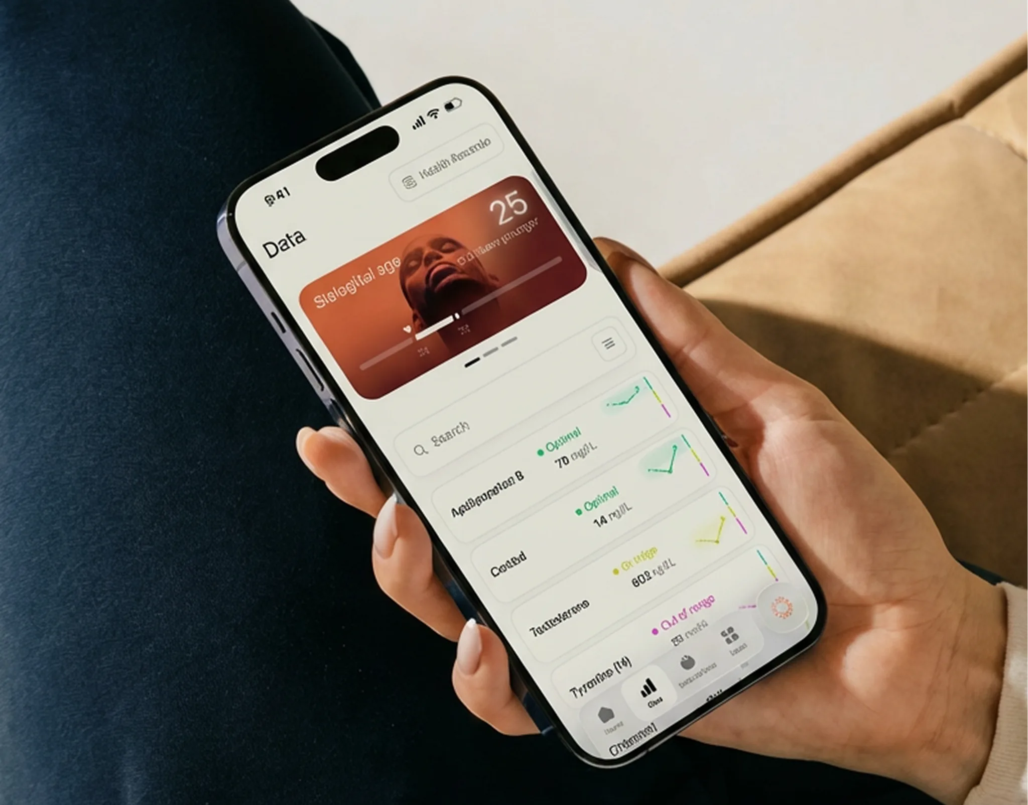
Navbar

The shared Superpower navbar used across LP templates. It mirrors the live site behavior: fixed positioning, desktop scroll morph into the dark blurred pill, centered logo scale, dotted hamburger control, and the right-side mobile menu.

Nav Light Mode

Nav Dark Mode

Nav Minified

The stripped LP nav for the PDP layout (CRO-PDP testing Figma 1SsiG9YladWmn8Xg0Z0KMl, node 248:166): wordmark, six section links, one CTA. Not the full sp-navbar3 mega-menu, and deliberately not sticky.

Hero Header

Figma source: Node 2-1200

Each option is one responsive JSX block — desktop has wider layouts, larger headlines, and side-by-side CTAs; mobile stacks vertically with full-width buttons.

Node Inventory

VariantNode IDLayout
Option 1986-5750Two-column copy, CTA row, USP row, square media card
Option 27-302Centered copy, CTA row, USP row, large media block
Option 37-299Inset background-media hero, centered white content
Option 47-300Inset background-media hero, left-aligned white content
Option 58-664Left-aligned copy with horizontal media rail
Option 68-719Centered copy with horizontal media rail
Option 78-807Two-column copy and staggered media grid
Option 8665-3574Content/stat row with large media block below
Hero with QuoteReference pageQuote-led doctor endorsement hero
Hero with Quote (Inverted)Reference pageQuote hero with image left and copy right
Hero Podcast 1Reference pagePodcast endorsement hero (quote layout, text pill, editable host image)
Hero Podcast 2 (Description)Reference pagePodcast hero with a plain description paragraph instead of a quote
Hero Influencer SpecialAoki live LPFull-bleed rounded card, copy left, bottom KPI row, desktop+mobile bg
Hero Partnerships1429-4082Partner mark above headline, 4:5 composite media column, centred copy

Option 1

4.7 out of 5Trustpilot

5 reasons to test your gut, now $100 off

Add the gut microbiome test for $100 off (usually $239) to your membership and baseline blood panel. Two tests, read together in one combined analysis. $338 total.

$100 off the gut testOne combined analysisAt-home stool sample

Option 2

Option 3

Option 4

Option 5

Option 6

Option 7

Option 8

Hero with Quote

Hero with Quote (Inverted)

Partnership Hero

Hero Podcast 1

Hero Podcast 2 (Description)

Hero Influencer Special

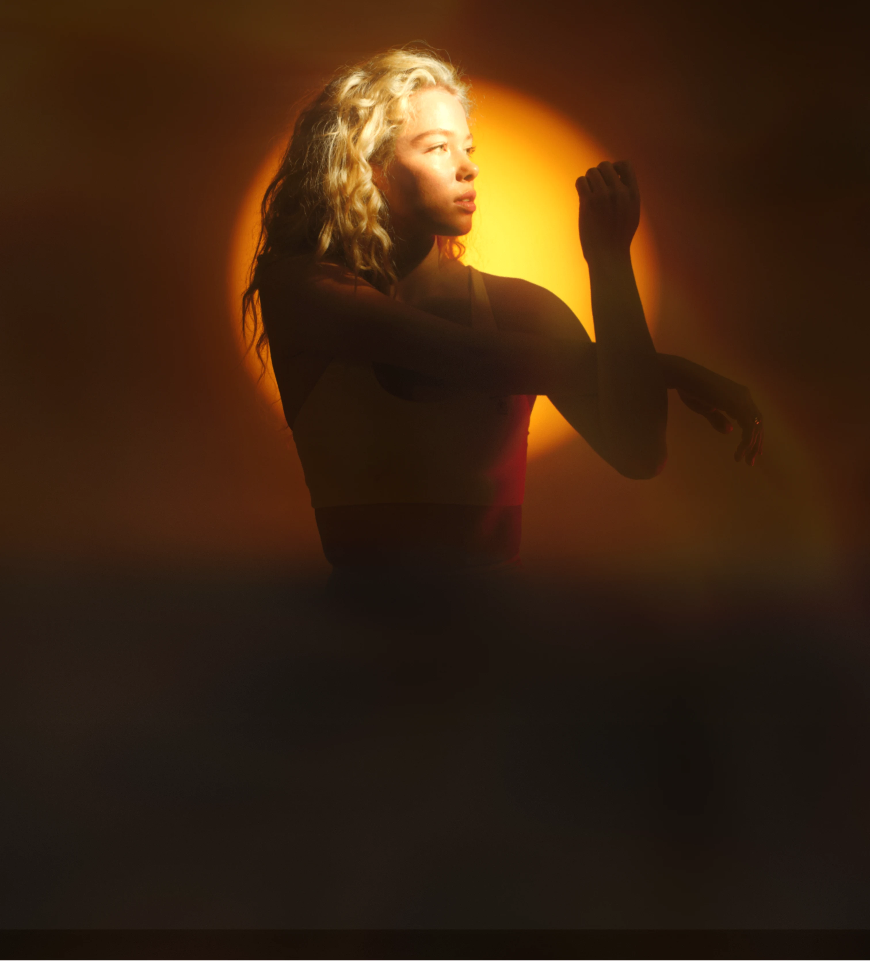
Ported 1:1 from the live wf.superpower.com/landing/steve-aoki section_sp2-home-hero.is-aoki-hero. A near-full-viewport rounded card: background photograph, copy left, and a KPI row pinned to the bottom. Built for portraits shot with the subject on the right and negative space on the left, which is what keeps the headline legible.

Two background uploads. The live page ships one pre-overlaid .avif; this variant takes a desktop image AND a mobile image, because the composition that works in landscape does not survive a portrait crop. The markup authors them loading="lazy", but at render time the shared media policy (live-media-policy.ts) flips hero-role images to eager, strips the img-level priority hint, and the server emits a media-qualified high-priority head preload per crop — the viewport's crop fetches first and at full priority; the hidden crop costs one low-priority duplicate download. A gradient scrim sits above both so white copy stays legible on any upload — the live Aoki asset has that gradient baked in, which a fresh upload will not.

The KPI row sits bottom left, under the copy, exactly as the reference renders it. To move it right instead, add self-end and swap pl for pr on that row.

Ladder measured at 1512 / 900 / 700 / 390: card height 100dvh - 5.5rem with a 5.5rem top margin on desktop, full 100dvh and no margin below 992; inner padding 4rem3rem1.5rem bottom with the left inset dropping to 0 at ≤767 (the copy carries 1.5rem/1.25rem of its own there); radius 0.75rem on desktop, square below 992 where it goes edge to edge.

Hero Partnerships

Built from Kevin's co-branded frame (Co-branded Landing Pages, node 1429-4082). Differs from Partnership Hero in three ways that matter, which is why it is its own variant rather than an edit of that one:

  • The partner mark stands alone above the headline at ~45px, instead of sitting in a superpower | partner lockup at 15px. Superpower's own wordmark is carried by the navbar. A 15px slot suits a pure wordmark like VAST's; it strands any logo that has a symbol in it (YPO's triangle rendered 39x15 against Superpower's 151x22).
  • The media column is 4:5 portrait and sized larger than the copy column (624 vs 515 in the design), for a full-bleed composite rather than a square product shot.
  • The copy column is vertically centred against that taller media, not stretched to match it.

The media slot takes a single composite export — the digital twin with its annotation callouts is one flattened image, not rebuilt as DOM. Leader lines and floating value cards depend on exact positions against the render; reproducing them in markup would drift the moment the image is swapped, and the whole point of the slot is that partners swap it.

Hero Author / Light

The opener of the Doctor / Paid Ads layout, rebuilt against Website-CROLatest on 2026-08-22 — desktop node 398:5778 (1512 × 896), mobile 414:8016 (393 × 855). The earlier Paid-Ads-LPs 796:72 frame is history.

An editorial hero: a byline under the headline puts a named clinician's authority on the page before anything else does. Copy left and a square media card right on desktop; on mobile the card goes first, full-width, and the copy follows — that inversion is in the reference and it is what makes the photograph the first thing on a paid-traffic mobile landing.

No navbar sits above this. The reference frame starts at y=0 with the hero. Pages that want one add the minified nav section; the template does not ship a hidden one.

The media card is a baked composite. The reference layers dashboard cards between two copies of the photograph (so the cards read as behind her) and then sets the Clinicians' Choice lockup over the bottom. All of it is one upload per breakpoint — replacing either file loses the dashboard cards and the lockup, so re-export 409:7140 / 414:8752 instead of swapping in a bare photo. The card is square at both breakpoints (704 desktop, 345 mobile), which is why there is no aspect switch.

Measured ladder: section padding 1.6875rem / 1.5rem block on mobile → 6rem at 992; copy column 32.1875rem (515) against a 44rem (704) card, justify-between inside the 80rem container; child gap 1rem1.5rem. Type steps 40/42 → 60/64 on the headline and 16/22 → 20/28 on the body, whose colour is the reference's literal #52525b. The body is capped at 29.4375rem (471) because the reference sets it narrower than the column it sits in.

Deleting any row is safe: the copy column spaces its children with gap, never margins, so removing the rating line, the byline or the paragraph closes the space instead of leaving a hole.

Want the warm version? Pick Hero Author / Tinted below instead — it is a sibling variant, not a toggle on this one, because the two need different assets.

Hero Author / Tinted

The warm sibling of Hero Author / Light. Ported 1:1 from Figma Hero_V2 — 798:1446.

Why a variant, not a toggle. The first pass shipped this as a page-level add-on (addOns.heroTint) that recoloured the light hero. Gabriel, 2026-08-07: it belongs to choosing this hero, not to the page. It is also not a recolour — the two heroes need different assets:

Hero AuthorHero Author (Tinted)
Backgroundwhite → grey gradienta measured five-stop warm gradient
Portraitstudio shot, in a rounded cardcut-out with alpha, standing on the gradient
Copytext-foreground / text-secondarywhite, eyebrow at 70%, date at 50%
CTAblack pillwhite pill, dark label
Rating lineavatar cluster, text-secondary copysame cluster, white rings + text-white/70 copy

Recolouring could never get there: the light hero's portrait carries its own pale studio backdrop, which reads as a panel floating on the tint rather than a subject standing in it. That was the visible defect in the add-on version.

The gradient is five measured stops of CSS, not an image. The reference composes it from a peach texture plus a rotated mix-blend-darken shape — the first pass shipped only the texture and came out visibly pinker and flatter, because all the depth lives in the blended layer. Sampling the composed result at six points and fitting one 107° ramp lands the same colour, weighs nothing, and means retinting the hero is a five-value edit rather than a new asset.

Logos

Figma source: Node 7-308

Two responsive variants. Each is one JSX block — desktop uses a single horizontal row, mobile stacks the headline above and reflows logos to wrap.

Style=Doctors

dr-vinjamoori
dr-connealy
dr-lufkin

Built by the world’s top doctors and scientists

stanfordharvarducsfoxford

Style=PR

Partnership Marquee

PR Marquee — PDP v4 (Figma 273:2042)

The PDP v4 press band: the shared PressLogo set (the same exports the PR marquee uses) at the Figma's legible grey (PressLogo's own 50% — without the old wrapper's extra opacity-30 that washed it out), plus the Yahoo Finance mark from the Figma scan. One marquee row, white edge fades, the Figma's 96px vertical padding.

Listicle

Figma source: Feature V6/Desktop — Node 472:6350

A single numbered listicle row. Two equal columns on desktop — eyebrow number, heading, body, and a CTA on the left; a rounded image on the right. Stacks to one column on mobile.

Listicle

01

Blood and gut, read together in one analysis

No standalone gut test offers this. We pair your 100+ biomarker blood panel with your gut results and read both in a single combined analysis, so patterns line up instead of sitting in two separate reports.

Listicle

Figma source: Feature V6/Desktop — Node 472:6350

A single numbered listicle row. Two equal columns on desktop — eyebrow number, heading, body, and a CTA on the left; a rounded image on the right. Stacks to one column on mobile.

Listicle

02

We read your gut down to the exact strain

Many tests round to a broad category and guess. We identify the specific strains living in your gut, so the read is precise instead of a vague label you cannot act on.

Listicle

Figma source: Feature V6/Desktop — Node 472:6350

A single numbered listicle row. Two equal columns on desktop — eyebrow number, heading, body, and a CTA on the left; a rounded image on the right. Stacks to one column on mobile.

Listicle

03

A plan, not just a chart

You get a personalized plan built from both tests, not a data dump to interpret alone. Clear next steps, tied to what your blood and gut are actually showing.

Listicle

Figma source: Feature V6/Desktop — Node 472:6350

A single numbered listicle row. Two equal columns on desktop — eyebrow number, heading, body, and a CTA on the left; a rounded image on the right. Stacks to one column on mobile.

Listicle

04

Catches what blind probiotics cannot

A diversity score, plus flags for Candida, parasites, inflammation-associated bacteria, and leaky-gut red flags. The things a random probiotic off the shelf can never tell you.

Social Proof

Figma source: Node 316-4416

Seven families of trust-building sections. Each is one responsive JSX block; the toggle resizes the preview frame so you can see desktop and mobile renderings of the same code.

Doctors V1

Doctors V2

Testimonials

Influencers

Reviews

Here's why thousands of members chose Superpower

The tools for preventative care

As an Integrative Women's Health Coach this is exactly what I was looking for, for myself and to recommend to my clients.

anastacia-drake

Anastacia Drake

Superpower member

Superpower by far has the best offering

The amount of blood required was far below competitors. The online marketplace completes the full offering for a one-stop-shop.

H

HL

Superpower member

Thank you Superpower!

They gave me a protocol to follow so I can take control of my health. I have a new workout plan, nutrition and supplement guidance to help me meet my goals. The concierge team is absolutely amazing too!

M

Mindi

Superpower member

From skeptical to total fan

I was skeptical but really wanted to get deeper look at my health and my PC wasn't willing to go this comprehensive. I've been so impressed with the entire experience!

C

Canterina Roman

Superpower member

Partnership Testimonial

Single Testimonial KPI

Quote Carousel

Figma source: Paid-Ads-LPsLatest807:8219 (mobile 847:14388). Part of the Doctor / Paid Ads layout.

Three member quotes side by side on desktop, one at a time on mobile, with the prev/next buttons centred underneath. Round portrait, centred quote, name and role — no card, no border, just the column on the page background.

Runs on the same MemberStoryCarousel as the story-02 payload rather than a third carousel implementation: that component takes slidesPerView={3} for the three-up row and arrows="below" to move its buttons out from over the slide.

Review Widget

The PDP v2 member-review widget (CRO-PDP testing Figma 1SsiG9YladWmn8Xg0Z0KMl, node 104:2), on the Mars pattern: a score summary (4.6 + stars + "Based on 260+ reviews on Trustpilot") with a "Read all reviews" action, then a STATIC grid of review cards — no marquee, no rating-distribution bars (we don't have the real distribution, and this page has been burned by invented numbers). All six reviews are real: three from Kevin's strawman (Mindi, HL, Anastacia Drake) and three from superpower.com/reviews (Allison B, Coltin R, Pete H) — that page carries ~94 real member reviews and is the source to pull from when this widget needs more. Anastacia's card uses her real ReviewerPhoto; the others use initials circles, never a stock face.

Doctors Dark Carousel

The dark "built by the world's leading doctors" band (CRO-PDP testing Figma 1SsiG9YladWmn8Xg0Z0KMl, node 273:2520). Reuses CliniciansSlider in its dark tone: a draggable rail of horizontal doctor cards (portrait, institution mark, name, role, one-line bio, Learn more) on a near-black ground.

Member Stories

The PDP v4 "Real people, real stories" band (CRO-PDP testing Figma 1SsiG9YladWmn8Xg0Z0KMl, node 273:2870): centered eyebrow, headline and Trustpilot proof line, then a three-up carousel of the Figma's six VIDEO testimonial cards — poster with a play affordance, the quote below, and an avatar / name / "Superpower Member" / Re-tested-pill footer. Posters are stills for now (video sourcing is Gabriel's call); the play button is the Figma affordance.

Doctors V1 Gradient

Doctors V1 on the Website-CRO gradient ground (Figma PCYluUeBYOyEFgaSo0mdW2, node 309:4162): identical layout and slider, near-black #212121 base with the warm radial glow rising from the bottom, white heading, dark-tone cards. Literally Doctors V1 + the gradient.

Used By Carousel

Clone of superpower.com's "Used by athletes, doctors, and members just like you" social-proof slider: a draggable rail of mixed cards — celebrity photo, press quotes (Yahoo, Forbes, Athletech), member app screenshot, and two creator video cards that play inline from the Superpower CDN. Cards are plain markup (builder-editable); UsedBySlider owns drag/wheel/snap.

Trustpilot Review Cards

Figma source: Website-CROLatest398:6159 (mobile 414:9080). Part of the 2026-08 Doctor / Paid Ads layout.

Three Trustpilot review cards side by side on desktop, one at a time on mobile, prev/next centred underneath. Card is #fafafa at radius 12 with 24 of padding, the five-star row on top, then the review title, the body, and the reviewer — content top-aligned inside a 296 floor, which is what gives the row its even bottom edge while a longer review is still free to grow past it.

Not Quote Carousel (#8) with a new skin. That variant is round portraits over centred quotes and it is live on two published pages, so this is its own entry. Both run the same MemberStoryCarousel engine — slidesPerView={3} and arrows="below", which already lands the reference's 48px buttons, their 8px gap and its 64px stand-off.

The 16px inter-card gap is a negative margin, not a gap. basis-1/3 resolves against the track, so widening the track by exactly one gap (-mr-4) and paying it back as slide padding (pr-4) gives 416-wide cards inside a 1280 container with the last one flush right. A plain gap would push the third card out of the viewport.

Two of the three reviewers have no photograph on Trustpilot, so they get an initials disc — never a stock face on a real person's review.

Listicle

Figma source: Feature V6/Desktop — Node 472:6350

A single numbered listicle row. Two equal columns on desktop — eyebrow number, heading, body, and a CTA on the left; a rounded image on the right. Stacks to one column on mobile.

Listicle

05

At-home, mess-free sample. Results in a few weeks.

Collect a simple stool sample at home and mail it in. No clinic visit. Processed at CLIA and CAP accredited labs, with results back in a few weeks.

Membership

Figma source: Node 665-5967 (desktop) · 665-5899 (mobile)

Clean white card with image left + content right (desktop) or stacked image-top, content-below (mobile). Pagination dots indicate the image is part of a 4-image carousel.

Membership

Membership slide 1
1 / 4

Two tests. One combined analysis. $100 off

Membership + baseline blood test + gut test + combined analysis

  • The Superpower Membership at $199: 100+ biomarkers in one blood draw
  • Gut microbiome test $139, $100 off the $239 price
  • One combined analysis of blood and gut, read together
  • Strain-level gut read, plus a diversity score
  • Flags Candida, parasites, inflammatory bacteria, leaky-gut red flags
  • At-home, mess-free stool sample, CLIA/CAP accredited labs
  • 24/7 answers from your care team
  • HSA/FSA eligible, cancel anytime
$338
total*Billed annually
Get blood + gut, $100 off
HSA/FSA eligibleCancel anytimeResults in a week

*$199 membership plus $139 gut test after $100 off. Pricing may vary for members in New York and New Jersey.

Partnership Membership

FAQ

Landing-page FAQ sections using the Dr. Leigh Connealy blood draw content. Two accordion variants for page body layouts.

FAQ Accordion

Frequently asked questions

FAQ Accordion 2

$100 off your gut microbiome test
A combined analysis of your blood and gut microbiome