The shared Superpower navbar used across LP templates. It mirrors the live site behavior: fixed positioning, desktop scroll morph into the dark blurred pill, centered logo scale, dotted hamburger control, and the right-side mobile menu.
Nav Light Mode
Nav Dark Mode
Nav Minified
The stripped LP nav for the PDP layout (CRO-PDP testing Figma 1SsiG9YladWmn8Xg0Z0KMl, node
248:166): wordmark, six section links, one CTA. Not the full sp-navbar3 mega-menu, and
deliberately not sticky.
The PDP nav after the 2026-08-24 review: wordmark centered, no CTA pill. On mobile the pill ran
long enough to sit over the wordmark, and the owner asked for the button removed on both
breakpoints rather than shortened.
Each option is one responsive JSX block — desktop has wider layouts, larger headlines, and side-by-side CTAs; mobile stacks vertically with full-width buttons.
Node Inventory
Variant
Node ID
Layout
Option 1
986-5750
Two-column copy, CTA row, USP row, square media card
Option 2
7-302
Centered copy, CTA row, USP row, large media block
Option 3
7-299
Inset background-media hero, centered white content
Option 4
7-300
Inset background-media hero, left-aligned white content
Option 5
8-664
Left-aligned copy with horizontal media rail
Option 6
8-719
Centered copy with horizontal media rail
Option 7
8-807
Two-column copy and staggered media grid
Option 8
665-3574
Content/stat row with large media block below
Hero with Quote
Reference page
Quote-led doctor endorsement hero
Hero with Quote (Inverted)
Reference page
Quote hero with image left and copy right
Hero Podcast 1
Reference page
Podcast endorsement hero (quote layout, text pill, editable host image)
Hero Podcast 2 (Description)
Reference page
Podcast hero with a plain description paragraph instead of a quote
Partner mark above headline, 4:5 composite media column, centred copy
Option 1
Option 2
Option 3
Option 4
Option 5
Option 6
Option 7
Option 8
Hero with Quote
Hero with Quote (Inverted)
Partnership Hero
Hero Podcast 1
Hero Podcast 2 (Description)
As heard on The BasementSave $20
Know what's really going on with your health
Test 100+ biomarkers and turn your blood test results into personalized insights, simple protocols, and action.
1 blood draw
per year
Personalized
action plan
24/7
guidance
*Pricing may vary for members in New York and New Jersey
Hero Influencer Special
Ported 1:1 from the live wf.superpower.com/landing/steve-aokisection_sp2-home-hero.is-aoki-hero.
A near-full-viewport rounded card: background photograph, copy left, and a KPI row pinned to the
bottom. Built for portraits shot with the subject on the right and negative space on the left, which
is what keeps the headline legible.
Two background uploads. The live page ships one pre-overlaid .avif; this variant takes a
desktop image AND a mobile image, because the composition that works in landscape does not survive a
portrait crop. The markup authors them loading="lazy", but at render time the shared media policy
(live-media-policy.ts) flips hero-role images to eager, strips the img-level priority hint, and
the server emits a media-qualified high-priority head preload per crop — the viewport's crop
fetches first and at full priority; the hidden crop costs one low-priority duplicate download.
A gradient scrim sits above both so white copy stays legible on any upload — the live
Aoki asset has that gradient baked in, which a fresh upload will not.
The KPI row sits bottom left, under the copy, exactly as the reference renders it. To move it
right instead, add self-end and swap pl for pr on that row.
Ladder measured at 1512 / 900 / 700 / 390: card height 100dvh - 5.5rem with a 5.5rem top margin
on desktop, full 100dvh and no margin below 992; inner padding 4rem → 3rem → 1.5rem bottom
with the left inset dropping to 0 at ≤767 (the copy carries 1.5rem/1.25rem of its own there);
radius 0.75rem on desktop, square below 992 where it goes edge to edge.
Hero Partnerships
Built from Kevin's co-branded frame (Co-branded Landing Pages, node 1429-4082). Differs from
Partnership Hero in three ways that matter, which is why it is its own variant rather than an
edit of that one:
The partner mark stands alone above the headline at ~45px, instead of sitting in a
superpower | partner lockup at 15px. Superpower's own wordmark is carried by the navbar. A 15px
slot suits a pure wordmark like VAST's; it strands any logo that has a symbol in it (YPO's
triangle rendered 39x15 against Superpower's 151x22).
The media column is 4:5 portrait and sized larger than the copy column (624 vs 515 in the
design), for a full-bleed composite rather than a square product shot.
The copy column is vertically centred against that taller media, not stretched to match it.
The media slot takes a single composite export — the digital twin with its annotation callouts
is one flattened image, not rebuilt as DOM. Leader lines and floating value cards depend on exact
positions against the render; reproducing them in markup would drift the moment the image is
swapped, and the whole point of the slot is that partners swap it.
Hero Author / Light
The opener of the Doctor / Paid Ads layout, rebuilt against
Website-CRO → Latest
on 2026-08-22 — desktop node 398:5778 (1512 × 896), mobile 414:8016 (393 × 855). The earlier
Paid-Ads-LPs796:72 frame is history.
An editorial hero: a byline under the headline puts a named clinician's authority on the page before
anything else does. Copy left and a square media card right on desktop; on mobile the card goes
first, full-width, and the copy follows — that inversion is in the reference and it is what makes
the photograph the first thing on a paid-traffic mobile landing.
No navbar sits above this. The reference frame starts at y=0 with the hero. Pages that want one
add the minified nav section; the template does not ship a hidden one.
One upload, not two. The desktop and mobile exports were byte-for-byte the same composition at
1035 and 1408, so this hero ships the 1408 only: a 44rem box at 2× and a 345 box at 4×. That also
sidesteps a trap worth knowing — a hero rendered as two CSS-hidden crops downloads both files on
every visit, because display:none does not cancel an eager fetch and live-media-policy sets
loading="eager" on everything carrying data-lp-media-role="hero". Measured at 1.6Mbps: 175KB
fetched to paint a 100KB picture. srcset does not fix it either, because the preload emitter writes
a plain href instead of imagesrcset, so the preload and the srcset pick different candidates.
The media card is a baked composite. The reference layers dashboard cards between two copies of
the photograph (so the cards read as behind her) and then sets the Clinicians' Choice lockup over
the bottom. All of it is one upload per breakpoint — replacing either file loses the dashboard cards
and the lockup, so re-export 409:7140 / 414:8752 instead of swapping in a bare photo. The card is
square at both breakpoints (704 desktop, 345 mobile), which is why there is no aspect switch.
Measured ladder: section padding 1.6875rem / 1.5rem block on mobile → 6rem at 992; copy column
32.1875rem (515) against a 44rem (704) card, justify-between inside the 80rem container;
child gap 1rem → 1.5rem. Type steps 40/42 → 60/64 on the headline and 16/22 → 20/28 on the body,
whose colour is the reference's literal #52525b. The body is capped at 29.4375rem (471) because
the reference sets it narrower than the column it sits in.
Deleting any row is safe: the copy column spaces its children with gap, never margins, so removing
the rating line, the byline or the paragraph closes the space instead of leaving a hole.
Want the warm version? Pick Hero Author / Tinted below instead — it is a sibling variant, not
a toggle on this one, because the two need different assets.
Hero Author / Tinted
The warm sibling of Hero Author / Light. Ported 1:1 from Figma
Hero_V2 — 798:1446.
Why a variant, not a toggle.
The first pass shipped this as a page-level add-on (addOns.heroTint) that recoloured the light
hero. Gabriel, 2026-08-07: it belongs to choosing this hero, not to the page. It is also not a
recolour — the two heroes need different assets:
Hero Author
Hero Author (Tinted)
Background
white → grey gradient
a measured five-stop warm gradient
Portrait
studio shot, in a rounded card
cut-out with alpha, standing on the gradient
Copy
text-foreground / text-secondary
white, eyebrow at 70%, date at 50%
CTA
black pill
white pill, dark label
Rating line
avatar cluster, text-secondary copy
same cluster, white rings + text-white/70 copy
Recolouring could never get there: the light hero's portrait carries its own pale studio backdrop,
which reads as a panel floating on the tint rather than a subject standing in it. That was the visible
defect in the add-on version.
The gradient is five measured stops of CSS, not an image. The reference composes it from a peach
texture plus a rotated mix-blend-darken shape — the first pass shipped only the texture and came out
visibly pinker and flatter, because all the depth lives in the blended layer. Sampling the composed
result at six points and fitting one 107° ramp lands the same colour, weighs nothing, and means
retinting the hero is a five-value edit rather than a new asset.
Not full-bleed on purpose. Kev asked to move the clinician pages off the Influencer Special
card. The portrait sits LEFT in its own rounded card with a name + credential caption pinned to
its bottom-left corner; the copy sits RIGHT: member rating line, H1, three check rows, one CTA.
No subhead. The section ships no nav of its own, it goes directly under the regular Navbar section.
Measured ladder at 1512: card 732 × 885 inset 8px, radius 12; copy column 560 starting 96px
after the card and vertically centred; caption inset 24 at 24/32. Below 992 the card becomes a
full-width square (8px inset), the caption drops to 18/24 inset 12, and the copy stacks at 24px
side padding with a 40/42 headline and a full-width CTA. Both breakpoints crop ONE upload with
object-cover, so a portrait export works for both.
Reveal runtime LAST so no sibling index moves (slot paths are positional). Fold cap (2026-09-15,
Gabriel: the hero ran past 100vh on desktop): Kev's 732×885 card plus the nav is 965px, taller than
a 900px laptop viewport, so at 992+ the card keeps its 48.93% column (the split screen) and is
h-[calc(100dvh - 5.5rem)] (nav 80px + the 8px inset) with aspect-auto, so hero + nav fill the
first screen exactly on every desktop height and the portrait crops top/bottom to fit (a shrunk
card left the copy floating left, and the earlier 885px cap left a gap under short heroes on tall
screens; Gabriel 2026-09-15). At 100dvh = 973 it is pixel-for-pixel Kev's frame. Same paragraph on purpose:
a new block before the toggle shifts the document index every slot path starts with.
Hero Clinician (Subhead)
Kev's clinician hero, second pass (2026-09-15, Kayla Barnes-Lentz + Sara Szal sign-off round).
Same card-left / copy-right anatomy as Hero Clinician above, with the one addition Connor and
DQ drew into the Figma copy pass: a 24/32 subhead between the H1 and the check rows
(Hero_Option 1 — 1108:1255).
Appended as its own variant so the four saved clinician pages on Hero Clinician keep their
slot paths (an inserted sibling would have shifted every check-row and CTA edit).
The portrait carries an explicit sizes (48.93vw on desktop, full width below 992) so the
optimizer's srcset lands on the 2× of the rendered card instead of a 100vw guess.
Hero Clinician (Frame 09-17)
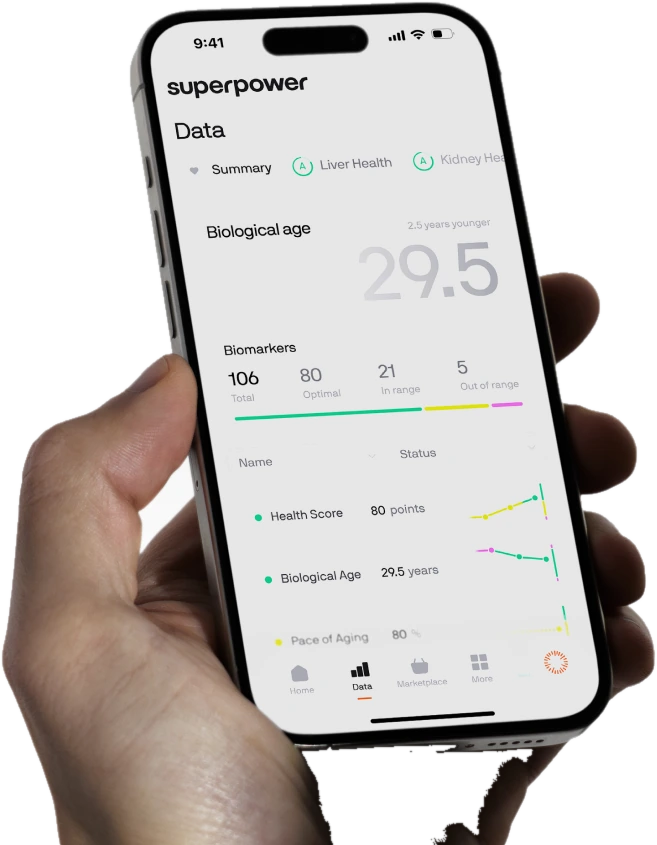
Kev's clinician hero redrawn 2026-09-17 on all four frames (Ashley 1121:1941, Sara 1175:632). Three changes from Hero Clinician (Subhead), which is why this is appended rather than edited — #19 is live on /lp/kayla-barnes and every saved edit there is keyed to its slot paths. (1) The columns swap: copy left, portrait right. DOM order is unchanged — the portrait is still the first child, so mobile keeps image-over-copy — and min-[62rem]:flex-row-reverse does the swap; with the same 48.93% / 35rem / 6rem gap that reproduces Kev's geometry exactly (portrait 732 wide ending 8px off the right edge, copy starting at x=116 on his 1512 frame). (2) The name chip leaves the portrait and becomes a 48px round avatar + name + "Updated on 9/2026" directly under the H1 (1438:4934); the three check rows stay in the markup under the subhead for pages that still want them, hidden per page with a hide edit. (3) A badge bar (1438:4902, 686×167, inset 23px from the portrait's bottom corners) sits over the photo — bg-black/16 + backdrop-blur-[2.25rem] is a real blur over the portrait, not a baked gradient, so the freshly baked portrait stays its own layer. EVERY measure inside it — the 23px inset off the card, the 28px padding, the 44.036px/21.719px type, the 258px seal, the 73px gutter — is a cqw fraction of the card (@container), because the card is a fixed fraction of the viewport: at 992 it is 479px wide and a fixed 44px "100+ Clinicians" would overflow the bar. The inset has to be cqw too, not inset-x-6: a fixed inset eats a bigger share of a small card, which squeezed the flexible text column harder than the type shrank and wrapped the headline at 992. The laurel seal is Kev's artwork exported whole (/lp-assets/clinicians-choice-seal-e075c9.svg, node 1438:4907 with the Figma page background stripped) and is deliberately NOT a slot — never rebuild the wreath by hand. Fold cap as on #18/#19: h-[calc(100dvh-5.5rem)] on the portrait at 992+, so hero + nav fill the first screen exactly and the portrait crops top/bottom instead of the column shrinking. One deliberate difference from #19: the copy column is NOT shrink-0. Between 992 and ~1100 the 48.93% card + 6rem gap + 35rem copy is wider than the row, and a shrink-0 copy column is pushed out of the row — to the left here, where flex-row-reverse puts the overflow, so the headline would be cut off by the section's overflow-hidden. Letting it shrink costs nothing above ~1100 (there is 108px of slack at 1512, so the column still measures 560 and still starts at x=116) and keeps the text on screen below it.
Hero Symptom Tags
Kev's women's symptom listicle hero (2026-09-25, desktop 2300:9890, mobile 2290:2840). Copy left, photo right, and seven glass symptom tags over the photo instead of #20's badge bar. The photo is its own layer (the Figma rectangle 2300:9892 exported at 2x) and every tag is live text, so a page can rename a symptom without a re-export. The card sits flush under the nav and 8px off the right edge exactly as drawn (calc(50% - 1.5rem) wide, 732 at 1512), with the same fold cap as #18–#20: its height is Kev's 885/732 ratio but never more than 100dvh minus the nav, so hero + nav fit the first screen and the photo crops instead. Tags are positioned in % of the card (mobile values from the 377² frame, desktop from the 732×885 card) and sized in cqw, so they scale with the card: 56/732 tall on desktop, 28/377 on mobile, the same 7.6% either way. On mobile the card is square with 8px side margins and the copy sits under it. Kev's 09-28 round moved the three trust badges into the hero, under the CTA (left-aligned on desktop, centred on mobile), so pages on this variant drop the separate LP Badges section.
Hero Clinician (Wide Copy)
Hero Clinician (Frame 09-17) with a 35rem copy column instead of 32.1875rem, so a two-word
line like "recommends Superpower" (544px at 48px) stays on one row (Sara Szal, 2026-10-01: the
type size stays, the portrait gives way). The portrait is min(40rem, row - 37rem) wide and square,
so the 35rem column plus a 2rem gap always fit: 640 at 1440+, 608 at 1280. Same DOM as #20, so a page
swaps between the two without losing a single edit.
Hero Partner Tint
Port of the Webflow co-branded hero on superpower.com/sequoia (also /alliantpnw, /transformation-capital):
a rounded full-width card over a wave photo, superpower | partner lockup, gradient headline, white pill CTA
and a tablet render bleeding off the bottom. The partner logo is a slot. The card's colour comes from the
page's heroTint add-on: applyLiveHeroTint derives four tones from one picked colour and stamps them as
--lp-hero-tint-* on [data-lp-hero-tint]; unset, every var falls back to the Sequoia green.
Hero Superpower Tint (No Logo)
Hero Partner Tint without the partner: Superpower's wordmark alone and a fixed graphite card, for
partners whose logo or colour does not hold up on the photo (Renee, 2026-10-07: "no client logo at all,
just superpower and fixed background"). Not wired to the heroTint add-on on purpose. Same DOM as #23
minus the divider and logo, so the copy slots line up for editors.
Hero Symptom List (Cutout)
Alex's hero image test arm for the women's symptom listicle (2026-10-08, Figma 2593:14884, "Hero image B · older woman"). Same copy column and DOM as #21, so a page swaps between the two without losing an edit; only the photo card differs. Instead of #21's glass tags the seven symptoms run down the left as a list (the active one full white, the rest at 60/40%) beside a tick ruler, and the subject is a cutout of the same photo laid OVER the list, so the words pass behind her head. Three layers, never flattened: background photo, list + ruler, cutout. The photo is width-fit with object-top everywhere and the list is placed in cqw, so it stays registered to her head at any card height; on mobile the square card crops the bottom of the shirt.
How Superpower Works
Ported 1:1 from the live /welcome-v3section_how-superpower-works. A left-aligned horizontal
slider of four image cards: drag, trackpad wheel (one card per gesture), and prev/next arrows.
How Superpower Works
How It Works — PDP v4
The PDP v4 booking-to-baseline section from Figma node 273:2056: a static three-card sequence
with the exact staged photography, responsive type, and baseline CTA from the approved desktop and
mobile frames.
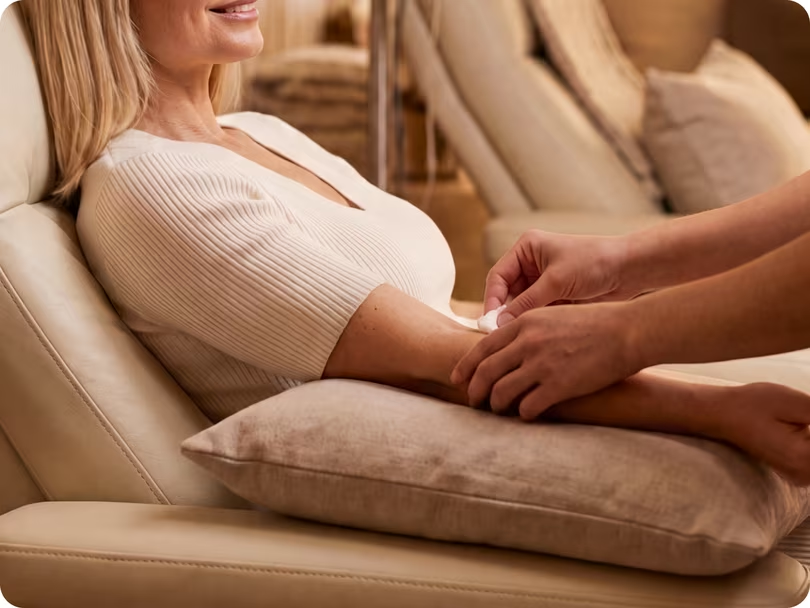
How it works
Booking to baseline in three steps
01
Book in 2 minutes
Pick a time in the app. A licensed phlebotomist comes to your home, no clinic, no
referral, no fasting surprises.
02
One 15-minute draw
One vial covers 100+ biomarkers. Results land in the app in days, each explained
in plain language.
03
Get your plan
A personalized action plan from your care team, built around your
results.
The live Figma node is named ↳ Biomarkers. One responsive layout: 3-col × 2-row grid on desktop with photographic anatomy icons; 2-col × 3-row text-only cards on mobile.
Biomarkers
Panel Biomarkers
Panel biomarker grid with membership-focused copy. It keeps the same editable
lab-logo, CTA, and biomarker-category layout as the primary Biomarkers section.
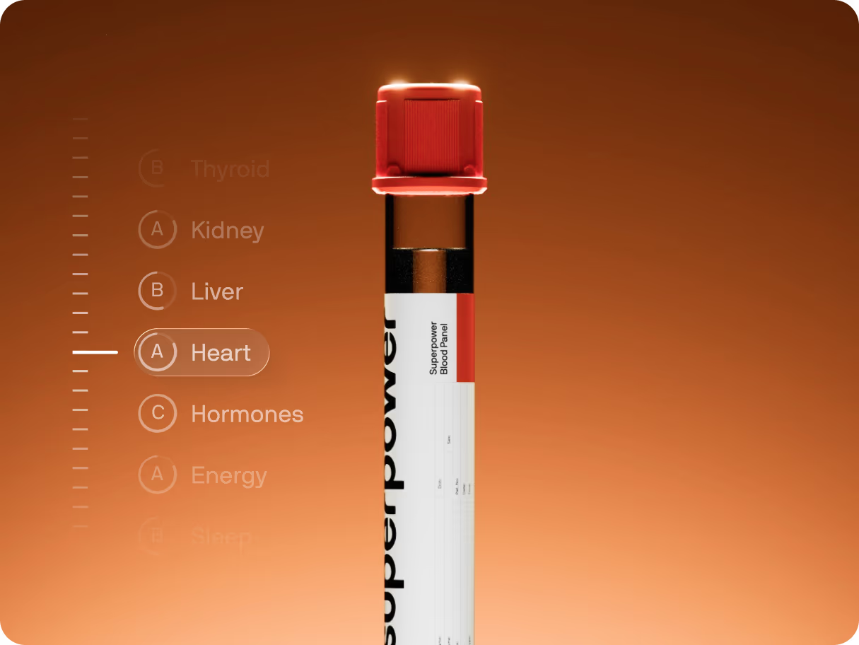
Conditions marquee: centered headline + tube image with two infinite text rows moving in opposite directions. The tube image reveals from below with blur and opacity as it enters the viewport.
Biomarkers Band
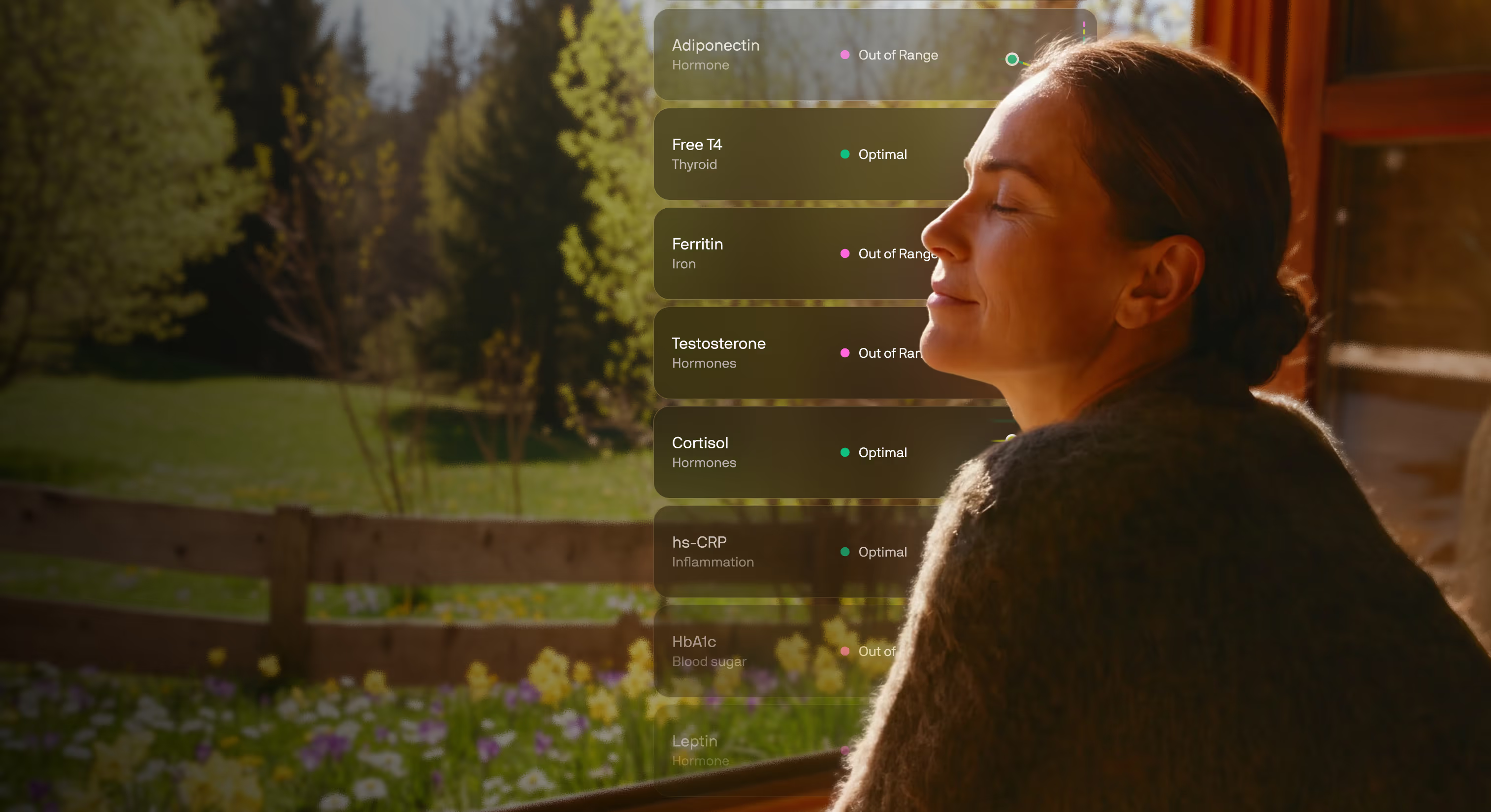
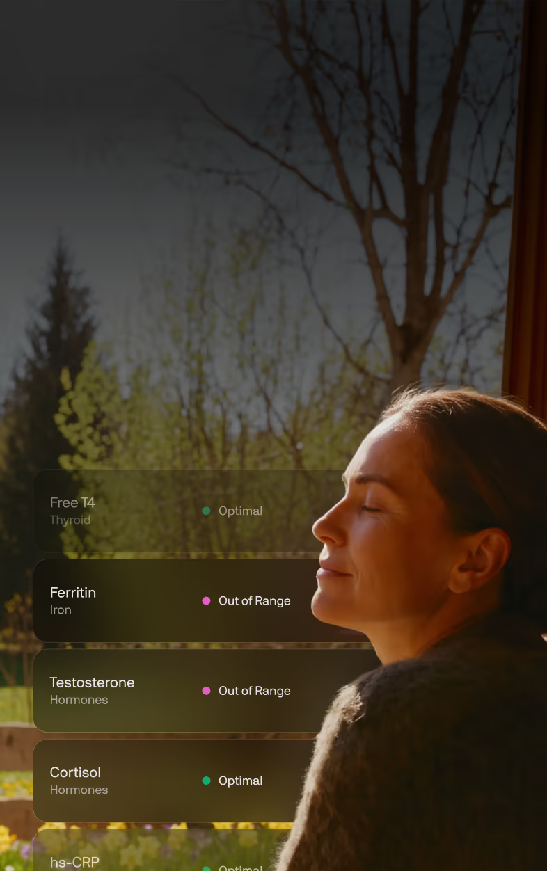
The full-bleed "one test, whole body" proof band (CRO-PDP testing Figma 1SsiG9YladWmn8Xg0Z0KMl,
node 273:2089). A warm photographic ground with the copy anchored left and a rail of live
biomarker result cards on the right that fade at the top and bottom so it reads as a longer list
scrolling behind the portrait. Rail is decorative proof; it hides below 992 where the photo and
copy stack.
One test. Your whole body, mapped.
Low energy and brain fog usually trace back to something measurable: thyroid, iron,
hormones, inflammation, blood sugar.
Male iteration of Biomarkers Band (Web-Design-System Figma N9pPrt8hYhGRhstYsIPArG, desktop
2279:23, mobile 2279:234). Same copy, layout and rail; only the baked photo changes — a man
outdoors at dusk with his results rail beside him. Built for the prostate offer page.
10 Days Timeline
Ported 1:1 from the live /welcome-v3section_10-days. A tall (220vh) section whose content is
position: sticky pinned for a viewport height; scrolling scrubs the ruler fill and reveals each
column. In non-scrolling previews (the builder canvas iframe, reduced motion, no-JS) it renders a
compact, fully-revealed timeline.
10 Days Timeline
First Year Milestones (PDP v4)
YOUR FIRST YEAR
What to expect, milestone by milestone
DAY 0
Your blood draw
15 minutes at a lab near you, or +$99 for an at home visit. 100+ markers, measured at once.
WEEK 1
Your baseline, explained
60% of members find something they didn't know about.
MONTH 1
Your protocol, in practice
The ranked actions turn into a routine, and your AI Concierge answers the questions the first month raises.
MONTH 3-6
Adjust as you go
Your AI Concierge answers as questions come up, and your on-demand care team can act on the ones that need a clinician.
MONTH 12
Renew for next year's test
Next year's membership starts with a new full panel, read against this year's baseline. You find out what actually moved. 93% of members rate it above their annual checkup.
First year — vertical timeline (Website-CRO 300:4386)
The vertical A/B counterpart of the milestone rail (Website-CRO Figma PCYluUeBYOyEFgaSo0mdW2,
desktop 300:4386, mobile 341:7703): a centre spine with a dot per milestone, media and copy
alternating sides at the Figma's 405px column / 215px gutter, 32px titles and 18px body. Mobile
runs the spine down the left edge — dot, then copy, then media filling the remaining width.
Seven families of trust-building sections. Each is one responsive JSX block; the toggle resizes the preview frame so you can see desktop and mobile renderings of the same code.
Three member quotes side by side on desktop, one at a time on mobile, with the prev/next buttons
centred underneath. Round portrait, centred quote, name and role — no card, no border, just the
column on the page background.
Runs on the same MemberStoryCarousel as the story-02 payload rather than a third carousel
implementation: that component takes slidesPerView={3} for the three-up row and
arrows="below" to move its buttons out from over the slide.
Review Widget
The PDP v2 member-review widget (CRO-PDP testing Figma 1SsiG9YladWmn8Xg0Z0KMl, node 104:2),
on the Mars pattern: a score summary (4.5 + stars + "Based on 350+ reviews on Trustpilot") with a
"Read all reviews" action, then a STATIC grid of review cards — no marquee, no rating-distribution
bars (we don't have the real distribution, and this page has been burned by invented numbers).
All six reviews are real: three from Kevin's strawman (Mindi, HL, Anastacia Drake) and three from
superpower.com/reviews (Allison B, Coltin R, Pete H) — that page carries ~94 real member reviews
and is the source to pull from when this widget needs more. Anastacia's card uses her real
ReviewerPhoto; the others use initials circles, never a stock face.
Doctors Dark Carousel
The dark "built by the world's leading doctors" band (CRO-PDP testing Figma
1SsiG9YladWmn8Xg0Z0KMl, node 273:2520). Reuses CliniciansSlider in its dark tone: a draggable
rail of horizontal doctor cards (portrait, institution mark, name, role, one-line bio, Learn more)
on a near-black ground.
Member Stories
The PDP v4 "Real people, real stories" band (CRO-PDP testing Figma 1SsiG9YladWmn8Xg0Z0KMl, node
273:2870): centered eyebrow, headline and Trustpilot proof line, then a three-up carousel of the
Figma's six VIDEO testimonial cards — poster with a play affordance, the quote below, and an
avatar / name / "Superpower Member" / Re-tested-pill footer. Posters are stills for now (video
sourcing is Gabriel's call); the play button is the Figma affordance.
Real members
Real people, real stories
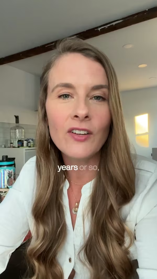
4.5 onTrustpilot64,000+ members
I was eating cleaner than I’d ever eaten but was having these symptoms. I didn’t feel good in my body anymore… I kind of felt like I got to the end of my rope.
Carissa K, 38
Superpower Member
It took me over an hour to fall asleep. Now, I fall asleep usually within minutes. To me, it’s a dream that never existed.
Daniel O, 22
Superpower Member
It was very sobering to realize that I thought I was healthy and in relatively great shape, but unfortunately there are things that I really need to take care of.
David L, 44
Superpower Member
It turns out I had Hashimoto’s. I was shocked… And at the same time, I felt really validated because I knew that I wasn’t crazy.
Rachel D, 36
Superpower Member
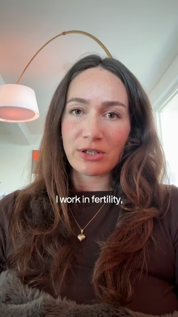
If I had had Superpower before, I would have had access to fertility testing through you guys, and no one would have put that barrier up for me.
Camelia V, 30
Superpower Member
You go through life thinking you’re gonna be healthy. Until you’re not. And when you’re not, it hits you like a brick wall. I was in a dark place... Now, I feel good, for the first time in a long time.
Chris S, 38
Superpower Member
Last year, I was diagnosed with breast cancer and it took me by surprise. After that, I was more inspired to take a proactive point of view when it comes to my health.
Rachel L, 30
Superpower Member
15 years of service, four tours overseas. That exposed me to things most people aren’t… That’s created health issues that led me to really understand what’s going on in my body.
Ron K, 53
Superpower Member
Superpower gave me a game plan. And honestly, I felt better last month than I felt in years.
John A, 57
Superpower Member
I asked my doctor for testing. They told me to start trying to conceive and if we can’t get pregnant in six months to come back. That seems backwards to me.
Darnah T, 37
Superpower Member
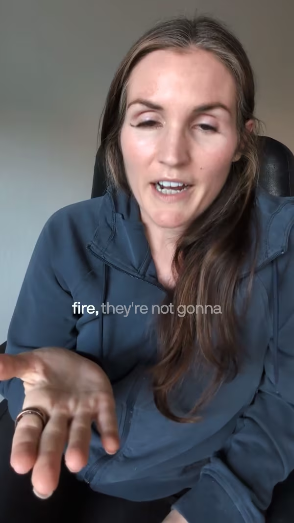
As a firefighter, recovery is everything. Superpower showed me my testosterone had dropped, likely driven by low vitamin D. Once I got on the right supplementation, my energy came back, my lifts got stronger... It was one simple change.
Kimani L, 44
Superpower Member
Doctors V1 Gradient
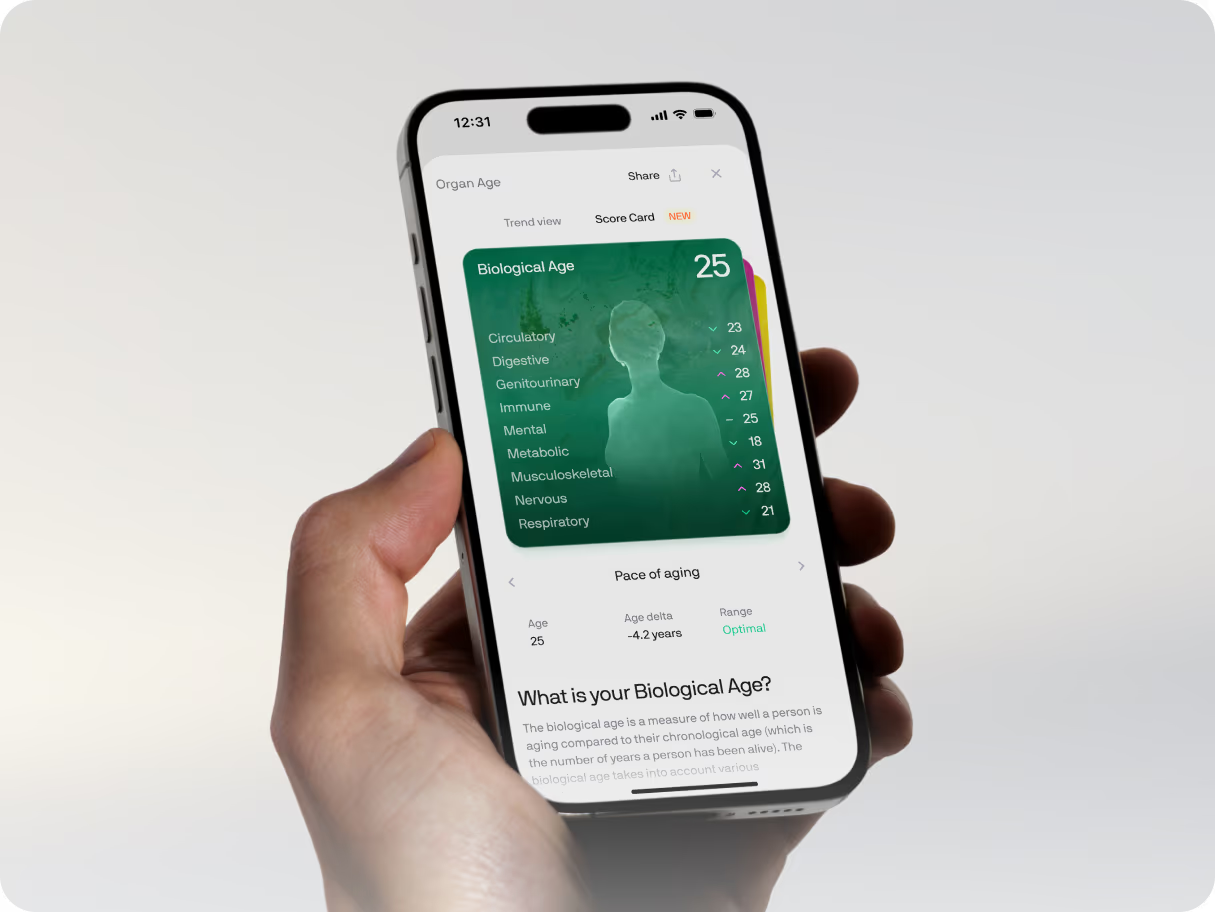
Doctors V1 on the Website-CRO gradient ground (Figma PCYluUeBYOyEFgaSo0mdW2, node 309:4162):
identical layout and slider, near-black #212121 base with the warm radial glow rising from the
bottom, white heading, dark-tone cards. Literally Doctors V1 + the gradient.
Used By Carousel
A draggable rail of mixed cards — celebrity photo, press quotes (Yahoo, Forbes, Athletech),
member app screenshot, and two creator video cards that play inline from the Superpower CDN.
Cards are plain markup (builder-editable); UsedBySlider owns drag/wheel/snap.
The lockup follows Website-CRO → Latest → 309:4295: centred "What members say about
Superpower", a "Read all reviews" pill, then the rail, then the inline Trustpilot proof row.
(It began as a clone of superpower.com's left-aligned "Used by athletes, doctors…" band.) The
reference also draws three Trustpilot review cards below this row — those are not here,
because the PDP carries the Review Widget (#9) for that and the owner moved it below the
membership section on 2026-08-24. Add Trustpilot Review Cards (#14) if both are wanted.
Three Trustpilot review cards side by side on desktop, one at a time on mobile, prev/next centred
underneath. Card is #fafafa at radius 12 with 24 of padding, the five-star row on top, then the
review title, the body, and the reviewer — content top-aligned inside a 296 floor, which is what
gives the row its even bottom edge while a longer review is still free to grow past it.
Not Quote Carousel (#8) with a new skin. That variant is round portraits over centred quotes
and it is live on two published pages, so this is its own entry. Both run the same
MemberStoryCarousel engine — slidesPerView={3} and arrows="below", which already lands the
reference's 48px buttons, their 8px gap and its 64px stand-off.
The 16px inter-card gap is a negative margin, not a gap.basis-1/3 resolves against the
track, so widening the track by exactly one gap (-mr-4) and paying it back as slide padding
(pr-4) gives 416-wide cards inside a 1280 container with the last one flush right. A plain gap
would push the third card out of the viewport.
Two of the three reviewers have no photograph on Trustpilot, so they get an initials disc — never a
stock face on a real person's review.
Reviews (White)
Kev Tang, 2026-09-17: Reviews and the comparison table both sat on the same grey, so the two
bands ran together. Same markup and slot structure as Reviews (#5) — only the two colours swap:
the section is white and the cards carry the grey.
Doctors V1 (Tight)
#1 with density="tight": 1rem of mobile block padding instead of 3rem, desktop untouched.
Appended 2026-09-18 for the clinician listicles, whose sections are capped at 2rem apart on
phones (Gabriel). #1 is on 100+ live pages, so it keeps its own spacing.
Video Testimonials (Tight)
#3 with 1rem of mobile block padding instead of 4rem, desktop untouched. Same reason, same
date, same rule: #3 is on 50+ live pages, so the tight copy is a separate variant and the DOM
below the section root is identical — a page swapped from #3 keeps every stored card edit.
Reviews (Rated)
Kev's reviews band on the women's symptom listicle (2026-09-28, 2321:3179): Reviews (White) re-cut to his frame — a rating line over the heading, the five reviews he chose for the page (hormones, dismissed-by-doctors, cost), boxed Trustpilot stars, 48px avatars and his type (18/26 title, 16/24 body; 16/22 and 14/21 on mobile). New variant rather than an edit to #15 because #15 is live on the clinician pages. The rating line reads "Trustpilot" where the frame says "260+ reviews": the count had no source when this shipped, and the 4.5 is the verified score. Initials avatars carry their colour in the markup (not a slot); the one photo avatar is a normal image slot.
PDP Demo
The "try before you buy" band of the PDP v2 layout (CRO-PDP testing Figma 1SsiG9YladWmn8Xg0Z0KMl,
demo node 117:3), aimed at the visitor who scrolled past the buy box without converting. A
centered teaser whose only job is the click: eyebrow, headline, one CTA, and the member app rising
out of the section's bottom edge on a warm glow. There is no fake embedded viewport and no
designed modal — the email-gated demo modal already exists (AppDemoModalPreview); this CTA
opens it.
The demo button is the appDemo add-on's
The button carries data-lp-demo-cta + data-modal="true" (no href — it opens the modal via the
document-level delegated listener in AppDemoModalPreview, and data-modal opts out of ButtonV2's
"Loading..." click state). It ships inline-hidden the way the hero's fallback CTA does: base.css
reveals [data-lp-demo-cta] — and this section's [data-lp-demo-cta-companion] reassurance
line — whenever the page root wears data-lp-demo-cta-visible, which the appDemo add-on stamps
server-side too, so there is no flash. It also carries data-lp-builder-cta-secondary so the
global main-CTA label/href add-ons never claim it. Because the button sits outside the hero,
applyLiveDemoCta never rewrites its label — it says whatever the MDX says.
With the add-on OFF the copy and product image still read as a complete app showcase; marketers
pair this section with the "Interactive demo" add-on toggle they already know.
PDP Demo
Try before you buy
The product is right here. Open it.
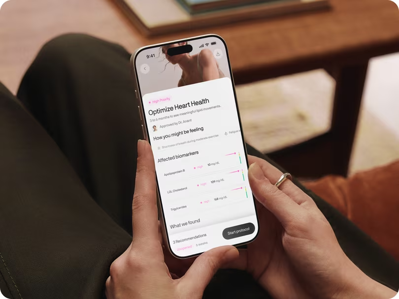
A real member dashboard, not a video walkthrough. Click through your biomarkers, the
action plan and the care team before you spend anything.
Enter your email and the demo opens. No card, no account — about 30 seconds.
Seven families of trust-building sections. Each is one responsive JSX block; the toggle resizes the preview frame so you can see desktop and mobile renderings of the same code.
Doctors V1
Designed by the world’s leading physicians and scientists
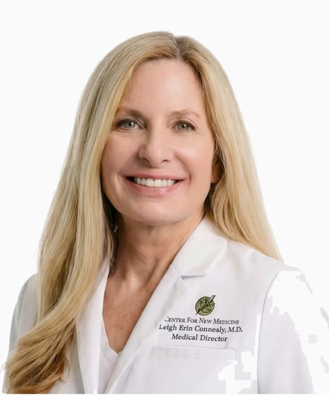
Dr Leigh Erin Connealy, MD
Clinician & Founder of The Centre for New Medicine
Leads the largest integrative medical clinic in North America. A pioneer in integrative oncology.
Dr Alex J. Tatem, MD
Board-certified Urologist and Men's Health Specialist
Internationally recognized specialist with 20+ peer-reviewed publications and award-winning research presentations.
Dr Robert Lufkin
UCLA Medical Professor, NYT Bestselling Author
A leading voice on metabolic health and longevity as shown in The Today Show, USA Today and FOX.
Dr Abe Malkin
Founder & Medical Director of Concierge MD
Leads a nationwide medical practice, and Drip Hydration, a mobile IV therapeutics company
Three member quotes side by side on desktop, one at a time on mobile, with the prev/next buttons
centred underneath. Round portrait, centred quote, name and role — no card, no border, just the
column on the page background.
Runs on the same MemberStoryCarousel as the story-02 payload rather than a third carousel
implementation: that component takes slidesPerView={3} for the three-up row and
arrows="below" to move its buttons out from over the slide.
Review Widget
The PDP v2 member-review widget (CRO-PDP testing Figma 1SsiG9YladWmn8Xg0Z0KMl, node 104:2),
on the Mars pattern: a score summary (4.5 + stars + "Based on 350+ reviews on Trustpilot") with a
"Read all reviews" action, then a STATIC grid of review cards — no marquee, no rating-distribution
bars (we don't have the real distribution, and this page has been burned by invented numbers).
All six reviews are real: three from Kevin's strawman (Mindi, HL, Anastacia Drake) and three from
superpower.com/reviews (Allison B, Coltin R, Pete H) — that page carries ~94 real member reviews
and is the source to pull from when this widget needs more. Anastacia's card uses her real
ReviewerPhoto; the others use initials circles, never a stock face.
Doctors Dark Carousel
The dark "built by the world's leading doctors" band (CRO-PDP testing Figma
1SsiG9YladWmn8Xg0Z0KMl, node 273:2520). Reuses CliniciansSlider in its dark tone: a draggable
rail of horizontal doctor cards (portrait, institution mark, name, role, one-line bio, Learn more)
on a near-black ground.
Member Stories
The PDP v4 "Real people, real stories" band (CRO-PDP testing Figma 1SsiG9YladWmn8Xg0Z0KMl, node
273:2870): centered eyebrow, headline and Trustpilot proof line, then a three-up carousel of the
Figma's six VIDEO testimonial cards — poster with a play affordance, the quote below, and an
avatar / name / "Superpower Member" / Re-tested-pill footer. Posters are stills for now (video
sourcing is Gabriel's call); the play button is the Figma affordance.
Doctors V1 Gradient
Doctors V1 on the Website-CRO gradient ground (Figma PCYluUeBYOyEFgaSo0mdW2, node 309:4162):
identical layout and slider, near-black #212121 base with the warm radial glow rising from the
bottom, white heading, dark-tone cards. Literally Doctors V1 + the gradient.
Used By Carousel
A draggable rail of mixed cards — celebrity photo, press quotes (Yahoo, Forbes, Athletech),
member app screenshot, and two creator video cards that play inline from the Superpower CDN.
Cards are plain markup (builder-editable); UsedBySlider owns drag/wheel/snap.
The lockup follows Website-CRO → Latest → 309:4295: centred "What members say about
Superpower", a "Read all reviews" pill, then the rail, then the inline Trustpilot proof row.
(It began as a clone of superpower.com's left-aligned "Used by athletes, doctors…" band.) The
reference also draws three Trustpilot review cards below this row — those are not here,
because the PDP carries the Review Widget (#9) for that and the owner moved it below the
membership section on 2026-08-24. Add Trustpilot Review Cards (#14) if both are wanted.
Three Trustpilot review cards side by side on desktop, one at a time on mobile, prev/next centred
underneath. Card is #fafafa at radius 12 with 24 of padding, the five-star row on top, then the
review title, the body, and the reviewer — content top-aligned inside a 296 floor, which is what
gives the row its even bottom edge while a longer review is still free to grow past it.
Not Quote Carousel (#8) with a new skin. That variant is round portraits over centred quotes
and it is live on two published pages, so this is its own entry. Both run the same
MemberStoryCarousel engine — slidesPerView={3} and arrows="below", which already lands the
reference's 48px buttons, their 8px gap and its 64px stand-off.
The 16px inter-card gap is a negative margin, not a gap.basis-1/3 resolves against the
track, so widening the track by exactly one gap (-mr-4) and paying it back as slide padding
(pr-4) gives 416-wide cards inside a 1280 container with the last one flush right. A plain gap
would push the third card out of the viewport.
Two of the three reviewers have no photograph on Trustpilot, so they get an initials disc — never a
stock face on a real person's review.
Reviews (White)
Kev Tang, 2026-09-17: Reviews and the comparison table both sat on the same grey, so the two
bands ran together. Same markup and slot structure as Reviews (#5) — only the two colours swap:
the section is white and the cards carry the grey.
Doctors V1 (Tight)
#1 with density="tight": 1rem of mobile block padding instead of 3rem, desktop untouched.
Appended 2026-09-18 for the clinician listicles, whose sections are capped at 2rem apart on
phones (Gabriel). #1 is on 100+ live pages, so it keeps its own spacing.
Video Testimonials (Tight)
#3 with 1rem of mobile block padding instead of 4rem, desktop untouched. Same reason, same
date, same rule: #3 is on 50+ live pages, so the tight copy is a separate variant and the DOM
below the section root is identical — a page swapped from #3 keeps every stored card edit.
Reviews (Rated)
Kev's reviews band on the women's symptom listicle (2026-09-28, 2321:3179): Reviews (White) re-cut to his frame — a rating line over the heading, the five reviews he chose for the page (hormones, dismissed-by-doctors, cost), boxed Trustpilot stars, 48px avatars and his type (18/26 title, 16/24 body; 16/22 and 14/21 on mobile). New variant rather than an edit to #15 because #15 is live on the clinician pages. The rating line reads "Trustpilot" where the frame says "260+ reviews": the count had no source when this shipped, and the 4.5 is the verified score. Initials avatars carry their colour in the markup (not a slot); the one photo avatar is a normal image slot.
The conversion block of the Doctor / Paid Ads layout, and the only section on that page with a
non-white background. Photo on the left; on the right an attribution pill that puts a named
clinician's face next to the panel, the benefit list, the price, one full-width CTA, and a row of
reassurances under it.
Every row is optional
The pill, any single bullet, the price sub-label and the reassurance row are all delete-safe — rows
carry their own top margin and the column has no gap, so removing one closes the space instead of
leaving a hole. That matters here more than anywhere else on the page: a partner LP without a named
doctor drops the pill, and a promo without a strikethrough drops the sub-label.
Note the heading runs 48/56 here, not the 48/52 used by numbered-story — this block gives its
title more room, and the ladder is the reference's.
Offer
Figma source: Website-CRO → Latest → 409:7313
(mobile 414:8296). The closing block of the 2026-08 Doctor / Paid Ads layout — rebuilt dark; the
earlier light bg-surface-secondary card is history.
Same 1280 grid as the numbered stories: a 39rem (624) portrait, then the 32.1875rem (515) column,
justify-between. The reference's background is a photographed warm gradient, exported per breakpoint
because a wide crop cannot cover a 393 × 987 phone frame without losing its vertical run — desktop
and mobile files, one visible at a time, over a #1b0800 base so nothing flashes white.
Everything else is real DOM and every string is a builder slot: the rating lockup (tone="invert"),
the H2, the price row, the hairline fact row, six checks, the CTA with the accent badge riding its
top edge, and the two-line legal footnote.
Updated 2026-08-25 from DQ's review pass — the reference changed the desktop offer only, so these
apply at both breakpoints (the mobile frame 414:8296 still shows the old state and is stale):
anchor price $349 → $298, the green Founding price pill is gone, and the checklist drops
"Discounted supplements delivered to you", lifts "On-demand care team" to row 4 and closes on "The
Connealy panel included (8 additional panels)" — her custom offer is now the last thing read
before the CTA.
The badge is positioned against the BUTTON, not the section, and ButtonV2 is overflow-hidden,
so it cannot be a child of it — hence the one wrapper div around the pair.
Membership Value (PDP v4)
Daniel OSuperpower memberDavid LSuperpower memberRachel DSuperpower memberCamelia VSuperpower member
4.5 · 64,000+ members4.5 on Trustpilot · 64,000+ members
Your health deserves more than a 10-minute check-up
*Pricing may vary for members in New York and New Jersey
Superpower found ferritin at 7% of optimal — critically depleted despite doing "all the right things." Within two months of the right protocol, her energy returned, brain fog lifted, and her cycles stabilized.
Larissa K.
Superpower Member
I was eating cleaner than I’d ever eaten but was having these symptoms. I didn’t feel good in my body anymore… I kind of felt like I got to the end of my rope.
Carissa K.
Superpower Member
I always trusted doctors, but when they’d say, ‘it’s just stress…’ I knew it wasn’t. Without Superpower testing I would have never known something was quietly impacting my health.
Cecilia H.
Superpower Member
Membership Value (PDP v4) Male
Same block as Membership Value (PDP v4) with the member stories swapped for three men (Web-Design-System Figma N9pPrt8hYhGRhstYsIPArG, node 2279:1060). Built for the prostate offer page.
Membership Value (Portrait)
The PDP v4 value stack with the right column swapped for ONE portrait, as Kev drew the
clinician-page membership band (2026-09-15,
Kayla 1110:953):
no member-story carousel, plain $349 everywhere ($0.96/day is the honest 349/365), heading "Get
your Superpower health membership", natural height (the v4 band's fixed 63.625rem made room for
the carousel; the portrait needs 685px + 96px each side = 877, Kev's number). Appended so the PDP
pages on variants #2/#3 are untouched. Since 2026-09-17 it also carries the R64 offer contract
(DQ: "use the PDP buybox on both pages so the offer stays linked and consistent"): data-lp-offer
on the root, data-lp-promo="price" with a base on both $349s and on the per-day line, so a
campaign price reverts on its own with no deploy. Attribute-only, so no slot path moved.
Footer
Mandatory final section for every landing page. One variant, no selection needed. Logo + newsletter signup, live Superpower link groups, App Store + Ask-AI badges, CEO video lightbox, and copyright bar.
Footer
Legal Disclaimer
Figma source: Website-CRO → Latest → 398:6228
(mobile 414:8335). Padding is the reference's 48 → 96, matching the story sections above it.
The closing block of the Doctor / Paid Ads layout: one muted paragraph at container width, sitting
between the offer and the site footer. Kept as its own section rather than folded into Footer so a
page can carry the disclaimer without the full footer, or the footer without the disclaimer.
Footer Minified
The stripped LP footer for the PDP layout (CRO-PDP testing Figma 1SsiG9YladWmn8Xg0Z0KMl, node
248:178): wordmark + CTA, section links, and a legal line. No WebGL background.
Footer Minified — Connealy
The same stripped footer as Footer Minified above with one difference that matters: its section
links. The default set points at the PDP's own section keys (biomarkers-band, how-it-works,
doctors, review-widget, buy-box, pdp-faq) and every one of them is a dead link on a page
that has none of those sections — scrollToSection finds no target, falls through to a #hash
that does not exist, and the click does nothing. This variant passes the Connealy layout's four real
destinations instead and drops the two with no equivalent (Doctors, FAQ).
Footer (White)
The site footer without the "Health is your superpower" CTA band and without the dark wrap behind
the card: plain white, square corners, as Kev's clinician frames end (2026-09-15). Same component,
cta={false}; Footer above is byte-identical.