The shared Superpower navbar used across LP templates. It mirrors the live site behavior: fixed positioning, desktop scroll morph into the dark blurred pill, centered logo scale, dotted hamburger control, and the right-side mobile menu.
Nav Light Mode
Nav Dark Mode
Nav Minified
The stripped LP nav for the PDP layout (CRO-PDP testing Figma 1SsiG9YladWmn8Xg0Z0KMl, node
248:166): wordmark, six section links, one CTA. Not the full sp-navbar3 mega-menu, and
deliberately not sticky.
Nav Logo Only
The PDP nav after the 2026-08-24 review: wordmark centered, no CTA pill. On mobile the pill ran
long enough to sit over the wordmark, and the owner asked for the button removed on both
breakpoints rather than shortened.
PDP Buy Box
PDP Buy Box — v4 fold (Figma 245:2055)
The signed-off v4 fold from CRO-PDP testing (1SsiG9YladWmn8Xg0Z0KMl, desktop 245:2055, mobile
289:385): sticky 14-slide gallery with the Clinicians' Choice slide-1 lockup and a scrolling
thumb rail, beside the full rich rail — social proof, H1, subhead, bordered plan card (price,
deadline, checklist, included-kit row, BEST VALUE ribbon), CTA, reassurance, payment chips,
Your-first-year card, stats card, Backed-by-the-world's-best (Giannis), member-stories video rail,
and the expanded FAQ. Uses the same PdpBuyBoxInteractions driver as v2 (gallery slide/drag,
rail arrows, biomarker-modal chips). ⚠️ The frontrowMD "without compensation" line and the
"Backed by" Giannis framing are pending Kat's sign-off — editable text slots on purpose.
PDP Buy Box B — simpler fold (Website-CRO 219:3637)
The A/B counterpart to the v4 fold (Website-CRO Figma PCYluUeBYOyEFgaSo0mdW2, rail rebuilt
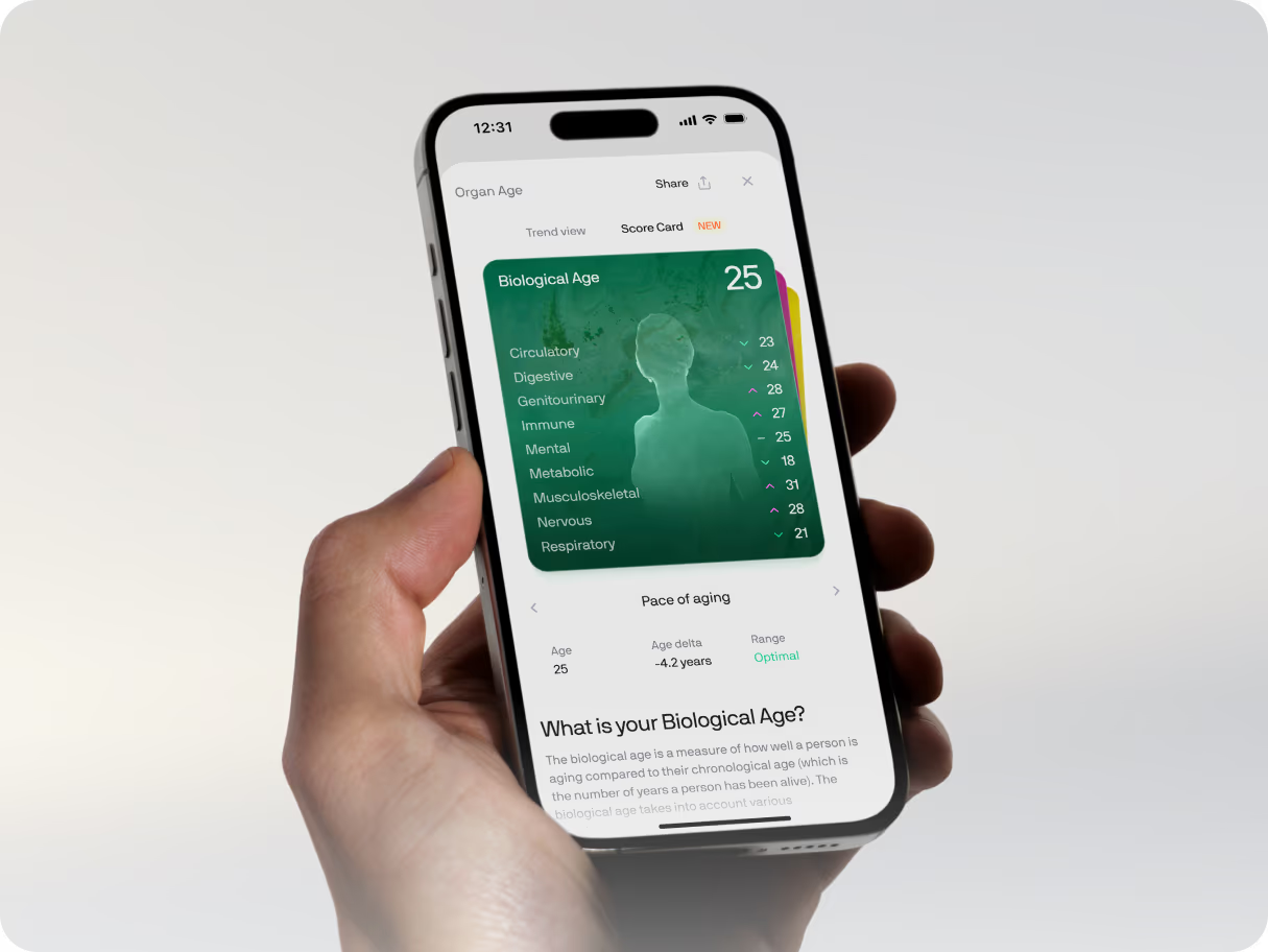
against 494:8919, gallery from 219:3637, mobile 337:5153): the biological-age portrait
leads a 6-slide gallery, the "What we test" chips carry green dots, and the rail is deliberately
lighter — price row with a green Labor Day promo pill, five circle-check bullets (150+ annual
positioning), the 6M+ badge riding the CTA, an icon meta row under the CTA (yearly · $0.55/day ·
HSA/FSA), the footnote pair, stats card and four collapsed accordions. Same
PdpBuyBoxInteractions driver and the same biomarker modal (the +90 more chip).
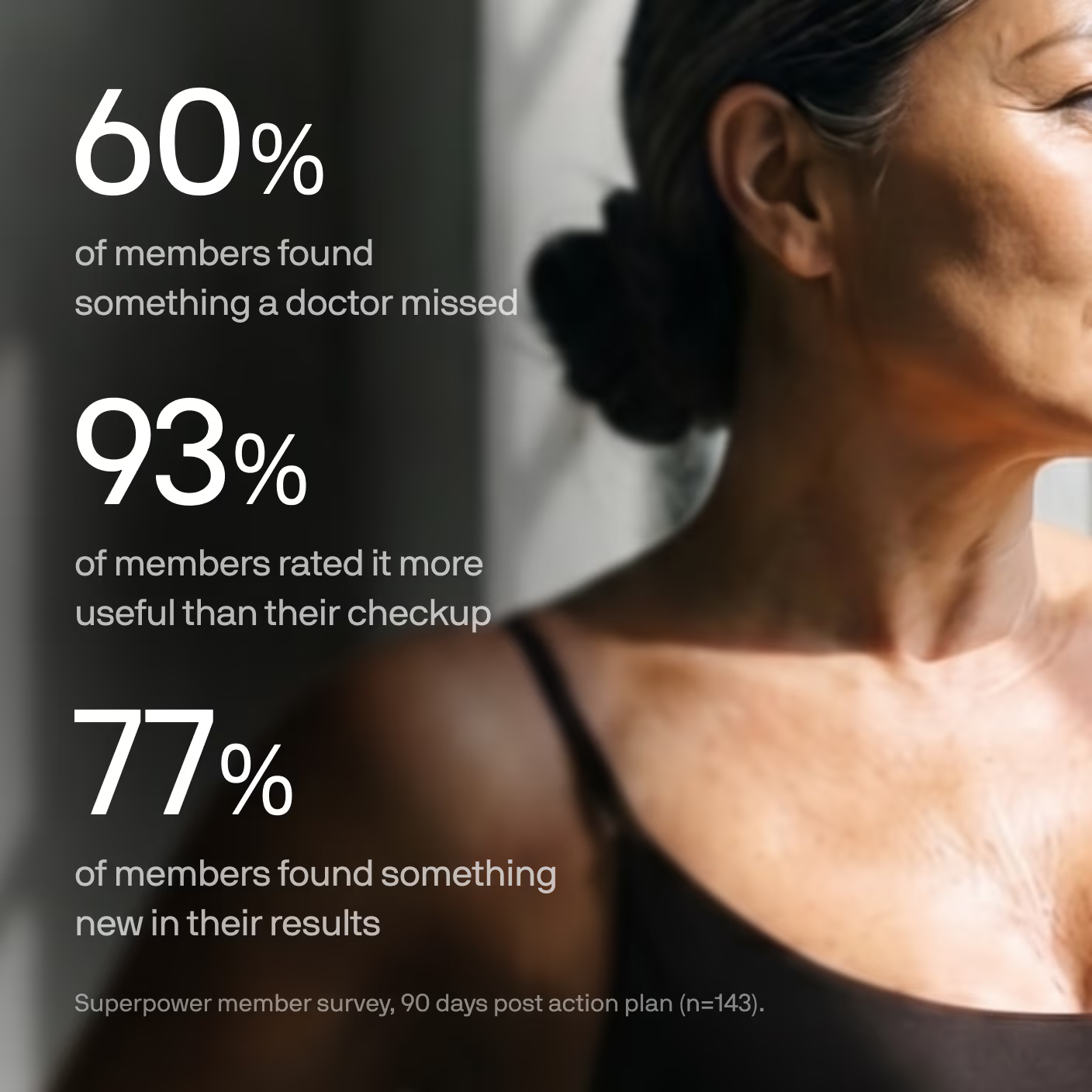
Superpower member survey, 90 days post action plan (n=143).
How does the Superpower membership work?
+
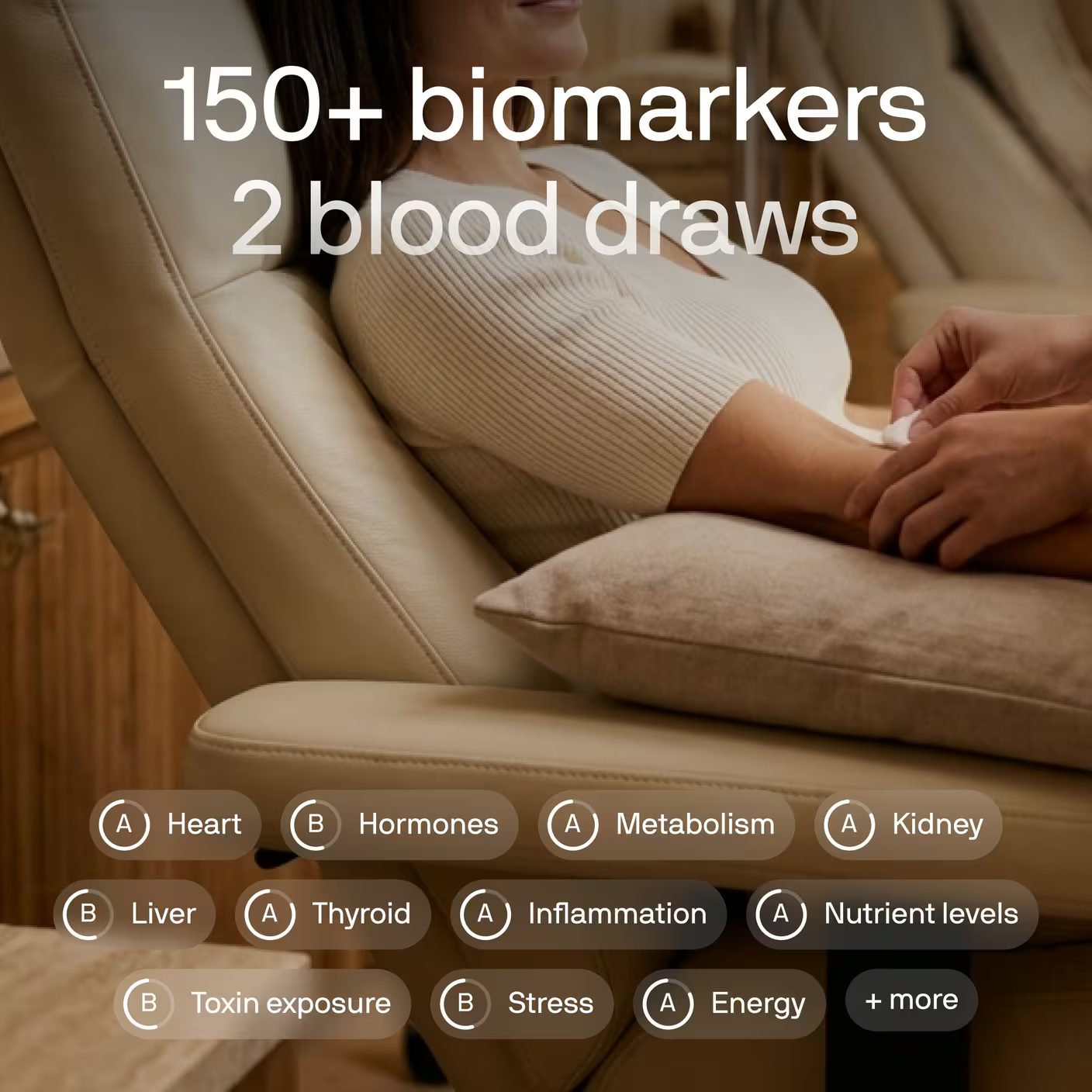
We test 150+ biomarkers annually across two blood draws. Your baseline test paints a comprehensive picture of your health, and your dashboard shows what’s working, what needs attention, and what to do next. Superpower AI and your care team help you take action across lifestyle, supplements, and treatments. Then we retest to track your progress and continue refining your plan.
Can I cancel anytime?
+
Yes. You can cancel anytime, no fees. Your membership stays active through the end of your paid year.
How often should I test?
+
Your membership includes two blood tests per year: one to establish your baseline, and one to see whether your plan improved biomarkers that were out of range or not yet optimized. You can add other diagnostics anytime through the app or with help from your care team.
When will I get my results?
+
Book your draw at any of 2,000+ partner labs or at-home. Results are typically ready in about a week and land in the Superpower app.
PDP Buy Box Tiers
The Buy Box B fold with the price row swapped for a three-tier quantity selector (CRO-PDP
testing Figma 1SsiG9YladWmn8Xg0Z0KMl, node 45:6): radio cards for 1 / 2 / 3 memberships —
per-person price, per-day math, a "most popular" banner on the two-pack and a best-value chip
on the three-pack. The selected card expands its benefit checklist. PdpBuyBoxInteractions
owns selection via the data-pdp-plan contract and syncs the chosen quantity + yearly total
into every checkout CTA on the page (buy CTA, nav pill, sticky bar). More memberships, more
savings — the save messaging lives on the cards as normal text slots.
PDP Buy Box (Clinician)
The welcome-v2 fold (variant #2) cloned for the clinician listicles, because DQ asked for that
exact buy box on them (Slack 2026-09-17: "Use the buy box from superpower.com/landing/welcome-v2
on both pages. Keep it linked so all pages stay consistent") and Kev drew it into all four
frames in place of the old membership stack. Identical to #2 except a SIXTH circle-check bullet,
"Biological age + 17 unique health scores", which his frames carry and #2 does not. Cloned rather
than added to #2 because #2 is live on /lp/pdp and /lp/pdp-v3, where a new bullet is nobody's
decision to make here. Everything else — the gallery rail, the biomarker modal, the
PdpBuyBoxInteractions driver and the R64 data-lp-offer contract — is byte-identical, so the
Labor Day promo it ships with takes itself down and the page reads $199 and $0.55 a day.
The pages swap slide 1 (and its thumb) for the clinician "Clinicians' Choice" card and hide the
"What we test" chip rails, which the frames do not show. The heading and price run at weight 400
and 3.5rem on desktop, not #2's 500 at 3.75rem: superpower.com's own .section_sp3-membership
renders both at 400 and 56.79px at 1512, and DQ read the heavier pair as "the font and price look
different" (2026-09-18).
Two responsive variants. Each is one JSX block — desktop uses a single horizontal row, mobile stacks the headline above and reflows logos to wrap.
Style=Doctors
Style=PR
Partnership Marquee
PR Marquee — PDP v4 (Figma 273:2042)
The PDP v4 press band: the shared PressLogo set (the same exports the PR marquee uses) at the
Figma's legible grey (PressLogo's own 50% — without the old wrapper's extra opacity-30 that
washed it out), plus the Yahoo Finance mark from the Figma scan. One marquee row, white edge
fades, the Figma's 96px vertical padding.
PR Marquee — Fast (PDP v4 logos at 45s)
The PDP v4 press band: the shared PressLogo set (the same exports the PR marquee uses) at the
Figma's legible grey (PressLogo's own 50% — without the old wrapper's extra opacity-30 that
washed it out), plus the Yahoo Finance mark from the Figma scan. One marquee row, white edge
fades, the Figma's 96px vertical padding.
PR Marquee — Connealy (Figma 398:5804)
The press band of the Connealy layout
(Website-CRO → Latest,
desktop 398:5804, mobile 414:8043). Same seven marks and same white edge fades as PR Marquee —
PDP v4; the only differences are the reference's own numbers, and they are the reason this is a
sibling rather than an edit to that one: 48 of vertical padding instead of 96, and a 34px
mobile logo cap instead of 24 (the reference scales the row to 70% on mobile, not 50%). Breakpoint is
62rem so the band switches with the rest of the Connealy page, not at Tailwind's lg.
⚠️ The Yahoo Finance mark is its own asset here, not the one #4 and #5 use.pdp-image-32102-01eb1f.webp, labelled "Yahoo Finance" in both of those variants, is actually a
green low-res TechCrunch lockup — so those bands show TechCrunch twice per loop, once at the
wrong size. This variant carries the real mark exported from 398:5808 at 4× and at the reference's
own 34px height. Worth fixing in #4 and #5 too, on their own change.
How Superpower Works
Ported 1:1 from the live /welcome-v3section_how-superpower-works. A left-aligned horizontal
slider of four image cards: drag, trackpad wheel (one card per gesture), and prev/next arrows.
How Superpower Works
How It Works — PDP v4
The PDP v4 booking-to-baseline section from Figma node 273:2056: a static three-card sequence
with the exact staged photography, responsive type, and baseline CTA from the approved desktop and
mobile frames.
How it works
Booking to baseline in three steps
01
Book in 2 minutes
Pick a time in the app. A licensed phlebotomist comes to your home, no clinic, no
referral, no fasting surprises.
02
One 15-minute draw
One vial covers 100+ biomarkers. Results land in the app in days, each explained
in plain language.
03
Get your plan
A personalized action plan from your care team. Work it, retest, and watch the
numbers move.
The live Figma node is named ↳ Biomarkers. One responsive layout: 3-col × 2-row grid on desktop with photographic anatomy icons; 2-col × 3-row text-only cards on mobile.
Biomarkers
Panel Biomarkers
Panel biomarker grid with membership-focused copy. It keeps the same editable
lab-logo, CTA, and biomarker-category layout as the primary Biomarkers section.
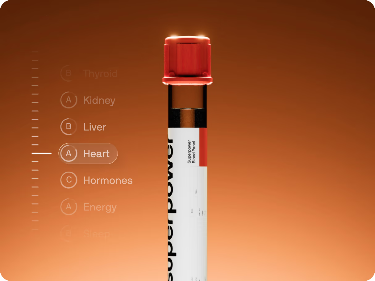
Conditions marquee: centered headline + tube image with two infinite text rows moving in opposite directions. The tube image reveals from below with blur and opacity as it enters the viewport.
Biomarkers Band
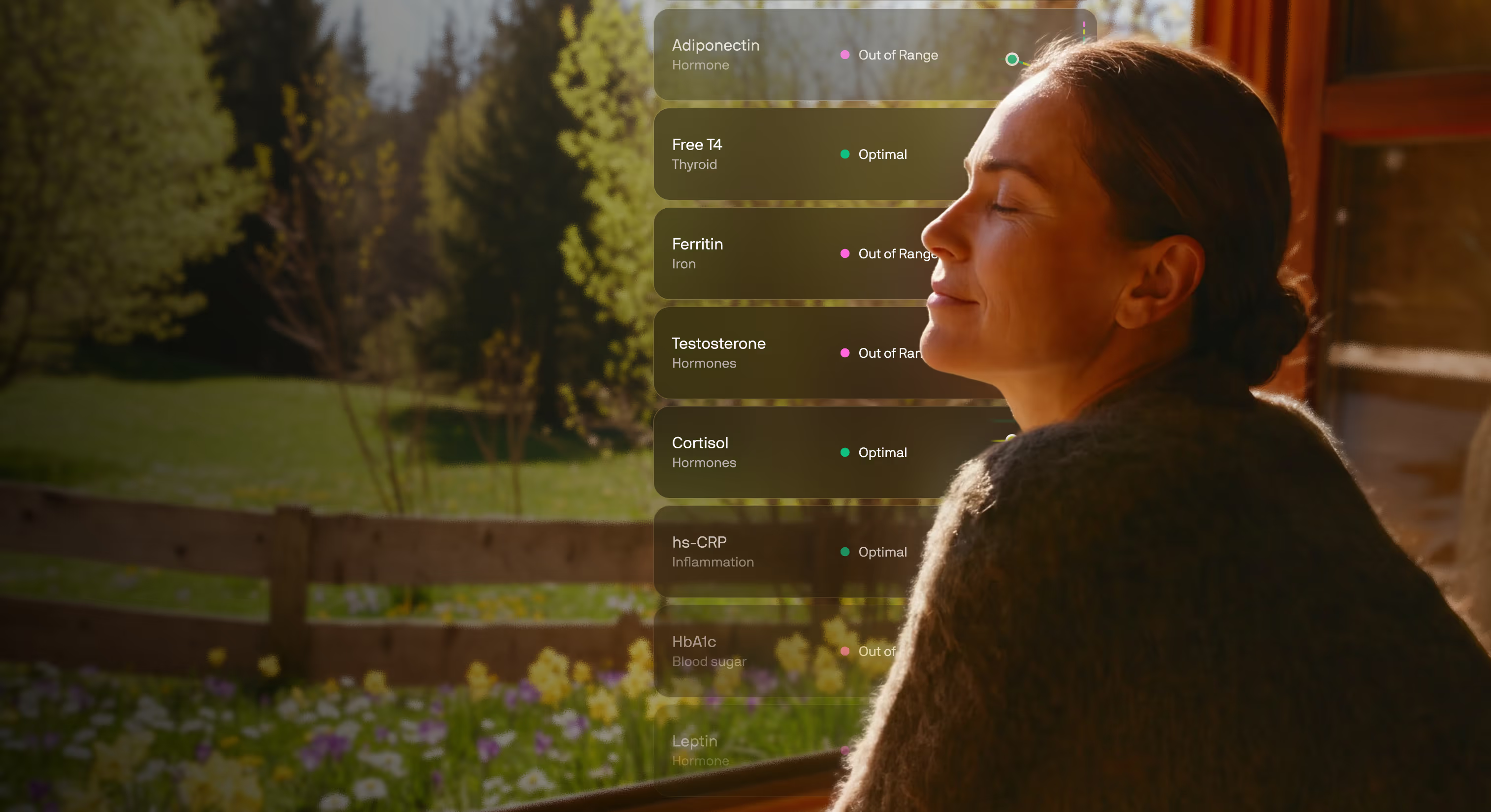
The full-bleed "one test, whole body" proof band (CRO-PDP testing Figma 1SsiG9YladWmn8Xg0Z0KMl,
node 273:2089). A warm photographic ground with the copy anchored left and a rail of live
biomarker result cards on the right that fade at the top and bottom so it reads as a longer list
scrolling behind the portrait. Rail is decorative proof; it hides below 992 where the photo and
copy stack.
One test. Your whole body, mapped.
Low energy and brain fog usually trace back to something measurable: thyroid, iron,
hormones, inflammation, blood sugar.
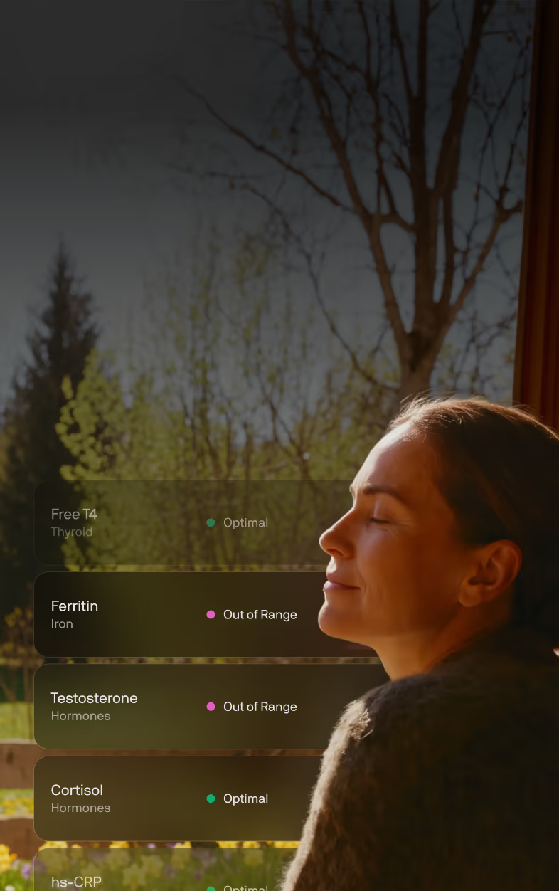
Male iteration of Biomarkers Band (Web-Design-System Figma N9pPrt8hYhGRhstYsIPArG, desktop
2279:23, mobile 2279:234). Same copy, layout and rail; only the baked photo changes — a man
outdoors at dusk with his results rail beside him. Built for the prostate offer page.
10 Days Timeline
Ported 1:1 from the live /welcome-v3section_10-days. A tall (220vh) section whose content is
position: sticky pinned for a viewport height; scrolling scrubs the ruler fill and reveals each
column. In non-scrolling previews (the builder canvas iframe, reduced motion, no-JS) it renders a
compact, fully-revealed timeline.
10 Days Timeline
First Year Milestones (PDP v4)
First year — vertical timeline (Website-CRO 300:4386)
The vertical A/B counterpart of the milestone rail (Website-CRO Figma PCYluUeBYOyEFgaSo0mdW2,
desktop 300:4386, mobile 341:7703): a centre spine with a dot per milestone, media and copy
alternating sides at the Figma's 405px column / 215px gutter, 32px titles and 18px body. Mobile
runs the spine down the left edge — dot, then copy, then media filling the remaining width.
Your first year
What to expect, milestone by milestone
DAY 0
Your blood draw
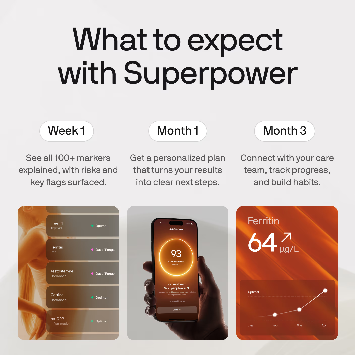
15 minutes at a lab near you, or +$99 for an at home visit. 100+ markers, measured at once.
WEEK 1
Your baseline, explained
60% of members find something they didn't know about.
MONTH 1
Your protocol, in practice
The ranked actions turn into a routine, and your AI Concierge answers the questions the first month raises.
MONTH 3-6
Adjust as you go
Your AI Concierge answers as questions come up, and your on-demand care team can act on the ones that need a clinician.
MONTH 12
Renew and retest
A second full panel, read against your own baseline. You find out what actually moved. 93% of members rate it above their annual checkup.
Seven families of trust-building sections. Each is one responsive JSX block; the toggle resizes the preview frame so you can see desktop and mobile renderings of the same code.
Three member quotes side by side on desktop, one at a time on mobile, with the prev/next buttons
centred underneath. Round portrait, centred quote, name and role — no card, no border, just the
column on the page background.
Runs on the same MemberStoryCarousel as the story-02 payload rather than a third carousel
implementation: that component takes slidesPerView={3} for the three-up row and
arrows="below" to move its buttons out from over the slide.
Review Widget
The PDP v2 member-review widget (CRO-PDP testing Figma 1SsiG9YladWmn8Xg0Z0KMl, node 104:2),
on the Mars pattern: a score summary (4.5 + stars + "Based on 350+ reviews on Trustpilot") with a
"Read all reviews" action, then a STATIC grid of review cards — no marquee, no rating-distribution
bars (we don't have the real distribution, and this page has been burned by invented numbers).
All six reviews are real: three from Kevin's strawman (Mindi, HL, Anastacia Drake) and three from
superpower.com/reviews (Allison B, Coltin R, Pete H) — that page carries ~94 real member reviews
and is the source to pull from when this widget needs more. Anastacia's card uses her real
ReviewerPhoto; the others use initials circles, never a stock face.
Doctors Dark Carousel
The dark "built by the world's leading doctors" band (CRO-PDP testing Figma
1SsiG9YladWmn8Xg0Z0KMl, node 273:2520). Reuses CliniciansSlider in its dark tone: a draggable
rail of horizontal doctor cards (portrait, institution mark, name, role, one-line bio, Learn more)
on a near-black ground.
Member Stories
The PDP v4 "Real people, real stories" band (CRO-PDP testing Figma 1SsiG9YladWmn8Xg0Z0KMl, node
273:2870): centered eyebrow, headline and Trustpilot proof line, then a three-up carousel of the
Figma's six VIDEO testimonial cards — poster with a play affordance, the quote below, and an
avatar / name / "Superpower Member" / Re-tested-pill footer. Posters are stills for now (video
sourcing is Gabriel's call); the play button is the Figma affordance.
Doctors V1 Gradient
Doctors V1 on the Website-CRO gradient ground (Figma PCYluUeBYOyEFgaSo0mdW2, node 309:4162):
identical layout and slider, near-black #212121 base with the warm radial glow rising from the
bottom, white heading, dark-tone cards. Literally Doctors V1 + the gradient.
Built by the world’s leading doctors and scientists
Dr Leigh Erin Connealy, MD
Clinician & Founder of The Centre for New Medicine
Leads the largest integrative medical clinic in North America. A pioneer in integrative oncology.
Dr Alex J. Tatem, MD
Board-certified Urologist and Men's Health Specialist
Internationally recognized specialist with 20+ peer-reviewed publications and award-winning research presentations.
Dr Robert Lufkin
UCLA Medical Professor, NYT Bestselling Author
A leading voice on metabolic health and longevity as shown in The Today Show, USA Today and FOX.
Dr Abe Malkin
Founder & Medical Director of Concierge MD
Leads a nationwide medical practice, and Drip Hydration, a mobile IV therapeutics company
Used By Carousel
A draggable rail of mixed cards — celebrity photo, press quotes (Yahoo, Forbes, Athletech),
member app screenshot, and two creator video cards that play inline from the Superpower CDN.
Cards are plain markup (builder-editable); UsedBySlider owns drag/wheel/snap.
The lockup follows Website-CRO → Latest → 309:4295: centred "What members say about
Superpower", a "Read all reviews" pill, then the rail, then the inline Trustpilot proof row.
(It began as a clone of superpower.com's left-aligned "Used by athletes, doctors…" band.) The
reference also draws three Trustpilot review cards below this row — those are not here,
because the PDP carries the Review Widget (#9) for that and the owner moved it below the
membership section on 2026-08-24. Add Trustpilot Review Cards (#14) if both are wanted.
Three Trustpilot review cards side by side on desktop, one at a time on mobile, prev/next centred
underneath. Card is #fafafa at radius 12 with 24 of padding, the five-star row on top, then the
review title, the body, and the reviewer — content top-aligned inside a 296 floor, which is what
gives the row its even bottom edge while a longer review is still free to grow past it.
Not Quote Carousel (#8) with a new skin. That variant is round portraits over centred quotes
and it is live on two published pages, so this is its own entry. Both run the same
MemberStoryCarousel engine — slidesPerView={3} and arrows="below", which already lands the
reference's 48px buttons, their 8px gap and its 64px stand-off.
The 16px inter-card gap is a negative margin, not a gap.basis-1/3 resolves against the
track, so widening the track by exactly one gap (-mr-4) and paying it back as slide padding
(pr-4) gives 416-wide cards inside a 1280 container with the last one flush right. A plain gap
would push the third card out of the viewport.
Two of the three reviewers have no photograph on Trustpilot, so they get an initials disc — never a
stock face on a real person's review.
Reviews (White)
Kev Tang, 2026-09-17: Reviews and the comparison table both sat on the same grey, so the two
bands ran together. Same markup and slot structure as Reviews (#5) — only the two colours swap:
the section is white and the cards carry the grey.
Doctors V1 (Tight)
#1 with density="tight": 1rem of mobile block padding instead of 3rem, desktop untouched.
Appended 2026-09-18 for the clinician listicles, whose sections are capped at 2rem apart on
phones (Gabriel). #1 is on 100+ live pages, so it keeps its own spacing.
Video Testimonials (Tight)
#3 with 1rem of mobile block padding instead of 4rem, desktop untouched. Same reason, same
date, same rule: #3 is on 50+ live pages, so the tight copy is a separate variant and the DOM
below the section root is identical — a page swapped from #3 keeps every stored card edit.
Reviews (Rated)
Kev's reviews band on the women's symptom listicle (2026-09-28, 2321:3179): Reviews (White) re-cut to his frame — a rating line over the heading, the five reviews he chose for the page (hormones, dismissed-by-doctors, cost), boxed Trustpilot stars, 48px avatars and his type (18/26 title, 16/24 body; 16/22 and 14/21 on mobile). New variant rather than an edit to #15 because #15 is live on the clinician pages. The rating line reads "Trustpilot" where the frame says "260+ reviews": the count had no source when this shipped, and the 4.5 is the verified score. Initials avatars carry their colour in the markup (not a slot); the one photo avatar is a normal image slot.
Seven families of trust-building sections. Each is one responsive JSX block; the toggle resizes the preview frame so you can see desktop and mobile renderings of the same code.
Three member quotes side by side on desktop, one at a time on mobile, with the prev/next buttons
centred underneath. Round portrait, centred quote, name and role — no card, no border, just the
column on the page background.
Runs on the same MemberStoryCarousel as the story-02 payload rather than a third carousel
implementation: that component takes slidesPerView={3} for the three-up row and
arrows="below" to move its buttons out from over the slide.
Review Widget
The PDP v2 member-review widget (CRO-PDP testing Figma 1SsiG9YladWmn8Xg0Z0KMl, node 104:2),
on the Mars pattern: a score summary (4.5 + stars + "Based on 350+ reviews on Trustpilot") with a
"Read all reviews" action, then a STATIC grid of review cards — no marquee, no rating-distribution
bars (we don't have the real distribution, and this page has been burned by invented numbers).
All six reviews are real: three from Kevin's strawman (Mindi, HL, Anastacia Drake) and three from
superpower.com/reviews (Allison B, Coltin R, Pete H) — that page carries ~94 real member reviews
and is the source to pull from when this widget needs more. Anastacia's card uses her real
ReviewerPhoto; the others use initials circles, never a stock face.
Doctors Dark Carousel
The dark "built by the world's leading doctors" band (CRO-PDP testing Figma
1SsiG9YladWmn8Xg0Z0KMl, node 273:2520). Reuses CliniciansSlider in its dark tone: a draggable
rail of horizontal doctor cards (portrait, institution mark, name, role, one-line bio, Learn more)
on a near-black ground.
Member Stories
The PDP v4 "Real people, real stories" band (CRO-PDP testing Figma 1SsiG9YladWmn8Xg0Z0KMl, node
273:2870): centered eyebrow, headline and Trustpilot proof line, then a three-up carousel of the
Figma's six VIDEO testimonial cards — poster with a play affordance, the quote below, and an
avatar / name / "Superpower Member" / Re-tested-pill footer. Posters are stills for now (video
sourcing is Gabriel's call); the play button is the Figma affordance.
Doctors V1 Gradient
Doctors V1 on the Website-CRO gradient ground (Figma PCYluUeBYOyEFgaSo0mdW2, node 309:4162):
identical layout and slider, near-black #212121 base with the warm radial glow rising from the
bottom, white heading, dark-tone cards. Literally Doctors V1 + the gradient.
Used By Carousel
A draggable rail of mixed cards — celebrity photo, press quotes (Yahoo, Forbes, Athletech),
member app screenshot, and two creator video cards that play inline from the Superpower CDN.
Cards are plain markup (builder-editable); UsedBySlider owns drag/wheel/snap.
The lockup follows Website-CRO → Latest → 309:4295: centred "What members say about
Superpower", a "Read all reviews" pill, then the rail, then the inline Trustpilot proof row.
(It began as a clone of superpower.com's left-aligned "Used by athletes, doctors…" band.) The
reference also draws three Trustpilot review cards below this row — those are not here,
because the PDP carries the Review Widget (#9) for that and the owner moved it below the
membership section on 2026-08-24. Add Trustpilot Review Cards (#14) if both are wanted.
Three Trustpilot review cards side by side on desktop, one at a time on mobile, prev/next centred
underneath. Card is #fafafa at radius 12 with 24 of padding, the five-star row on top, then the
review title, the body, and the reviewer — content top-aligned inside a 296 floor, which is what
gives the row its even bottom edge while a longer review is still free to grow past it.
Not Quote Carousel (#8) with a new skin. That variant is round portraits over centred quotes
and it is live on two published pages, so this is its own entry. Both run the same
MemberStoryCarousel engine — slidesPerView={3} and arrows="below", which already lands the
reference's 48px buttons, their 8px gap and its 64px stand-off.
The 16px inter-card gap is a negative margin, not a gap.basis-1/3 resolves against the
track, so widening the track by exactly one gap (-mr-4) and paying it back as slide padding
(pr-4) gives 416-wide cards inside a 1280 container with the last one flush right. A plain gap
would push the third card out of the viewport.
Two of the three reviewers have no photograph on Trustpilot, so they get an initials disc — never a
stock face on a real person's review.
Reviews (White)
Kev Tang, 2026-09-17: Reviews and the comparison table both sat on the same grey, so the two
bands ran together. Same markup and slot structure as Reviews (#5) — only the two colours swap:
the section is white and the cards carry the grey.
Doctors V1 (Tight)
#1 with density="tight": 1rem of mobile block padding instead of 3rem, desktop untouched.
Appended 2026-09-18 for the clinician listicles, whose sections are capped at 2rem apart on
phones (Gabriel). #1 is on 100+ live pages, so it keeps its own spacing.
Video Testimonials (Tight)
#3 with 1rem of mobile block padding instead of 4rem, desktop untouched. Same reason, same
date, same rule: #3 is on 50+ live pages, so the tight copy is a separate variant and the DOM
below the section root is identical — a page swapped from #3 keeps every stored card edit.
Reviews (Rated)
Kev's reviews band on the women's symptom listicle (2026-09-28, 2321:3179): Reviews (White) re-cut to his frame — a rating line over the heading, the five reviews he chose for the page (hormones, dismissed-by-doctors, cost), boxed Trustpilot stars, 48px avatars and his type (18/26 title, 16/24 body; 16/22 and 14/21 on mobile). New variant rather than an edit to #15 because #15 is live on the clinician pages. The rating line reads "Trustpilot" where the frame says "260+ reviews": the count had no source when this shipped, and the 4.5 is the verified score. Initials avatars carry their colour in the markup (not a slot); the one photo avatar is a normal image slot.
Three responsive table concepts. Each is one JSX block — desktop renders the full layout with side-by-side columns; mobile reflows columns into stacked cards.
Table V1
Table V2
Table V3
Table V4
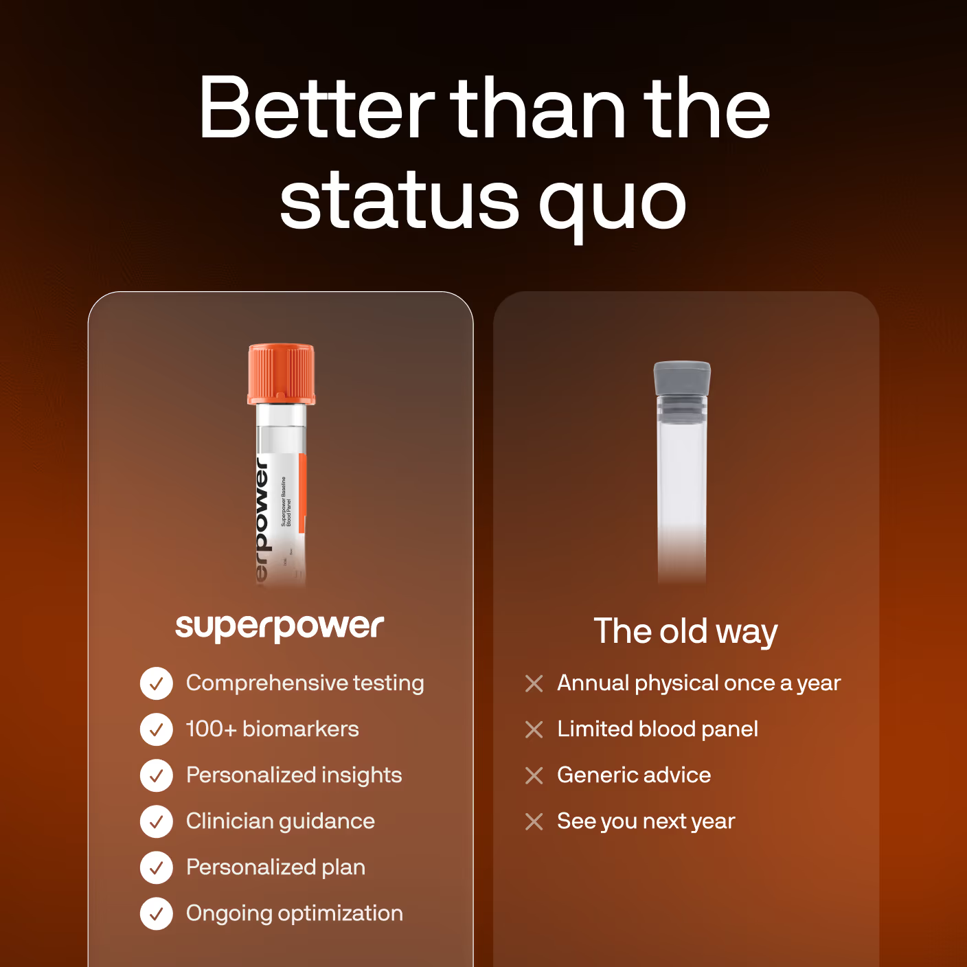
The PDP comparison band (CRO-PDP testing Figma 1SsiG9YladWmn8Xg0Z0KMl, node 273:2787): a five-row
head-to-head of a standard physical against Superpower, with the Superpower column lifted into a
highlighted panel. Never names a competitor.
The PDP iteration of "How Superpower compares" (Website-CRO Figma PCYluUeBYOyEFgaSo0mdW2,
comparison table): Table V1's two-column card grid on mobile (labels repeated inside each cell,
the Superpower column lifted onto a white card), and the Figma's three-column desktop with the
icon label rail. Same section identity on every breakpoint.
The current PDP iteration of "How Superpower compares" (Website-CRO Figma PCYluUeBYOyEFgaSo0mdW2,
comparison table): Table V1's two-column card grid on mobile (labels repeated inside each cell,
the Superpower column lifted onto a white card), and the Figma's three-column desktop with the
icon label rail. Same section identity on every breakpoint.
Differs from V5 (which other pages still run, so V5 must not change): the Superpower column is
headed by the real wordmark instead of typed text, the mobile cells put the row label ABOVE its
value (the label read as belonging to the row below it), and the mobile Superpower cells carry no
checkmark. Photo tiles are the 2026-08-24 set.
Table V5 with Kev Tang's 2026-09-17 mobile fix (Paid-Ads-LPs 0U3QgsVkLkc8EvyS4nHerV, frame
1442:10976): on mobile the check icon is gone (it crowded the cell) and each small row label
sits ABOVE its value, so a cell reads label-then-answer instead of answer-then-label. Desktop is
byte-identical to V5 — V5 itself must not change, /lp/prostate and /lp/biological-age run it.
Seven families of trust-building sections. Each is one responsive JSX block; the toggle resizes the preview frame so you can see desktop and mobile renderings of the same code.
Three member quotes side by side on desktop, one at a time on mobile, with the prev/next buttons
centred underneath. Round portrait, centred quote, name and role — no card, no border, just the
column on the page background.
Runs on the same MemberStoryCarousel as the story-02 payload rather than a third carousel
implementation: that component takes slidesPerView={3} for the three-up row and
arrows="below" to move its buttons out from over the slide.
Review Widget
The PDP v2 member-review widget (CRO-PDP testing Figma 1SsiG9YladWmn8Xg0Z0KMl, node 104:2),
on the Mars pattern: a score summary (4.5 + stars + "Based on 350+ reviews on Trustpilot") with a
"Read all reviews" action, then a STATIC grid of review cards — no marquee, no rating-distribution
bars (we don't have the real distribution, and this page has been burned by invented numbers).
All six reviews are real: three from Kevin's strawman (Mindi, HL, Anastacia Drake) and three from
superpower.com/reviews (Allison B, Coltin R, Pete H) — that page carries ~94 real member reviews
and is the source to pull from when this widget needs more. Anastacia's card uses her real
ReviewerPhoto; the others use initials circles, never a stock face.
Doctors Dark Carousel
The dark "built by the world's leading doctors" band (CRO-PDP testing Figma
1SsiG9YladWmn8Xg0Z0KMl, node 273:2520). Reuses CliniciansSlider in its dark tone: a draggable
rail of horizontal doctor cards (portrait, institution mark, name, role, one-line bio, Learn more)
on a near-black ground.
Member Stories
The PDP v4 "Real people, real stories" band (CRO-PDP testing Figma 1SsiG9YladWmn8Xg0Z0KMl, node
273:2870): centered eyebrow, headline and Trustpilot proof line, then a three-up carousel of the
Figma's six VIDEO testimonial cards — poster with a play affordance, the quote below, and an
avatar / name / "Superpower Member" / Re-tested-pill footer. Posters are stills for now (video
sourcing is Gabriel's call); the play button is the Figma affordance.
Real members
Real people, real stories
4.5 onTrustpilot64,000+ members
I was eating cleaner than I’d ever eaten but was having these symptoms. I didn’t feel good in my body anymore… I kind of felt like I got to the end of my rope.
Carissa K, 38
Superpower Member
It took me over an hour to fall asleep. Now, I fall asleep usually within minutes. To me, it’s a dream that never existed.
Daniel O, 22
Superpower Member
It was very sobering to realize that I thought I was healthy and in relatively great shape, but unfortunately there are things that I really need to take care of.
David L, 44
Superpower Member
It turns out I had Hashimoto’s. I was shocked… And at the same time, I felt really validated because I knew that I wasn’t crazy.
Rachel D, 36
Superpower Member
If I had had Superpower before, I would have had access to fertility testing through you guys, and no one would have put that barrier up for me.
Camelia V, 30
Superpower Member
You go through life thinking you’re gonna be healthy. Until you’re not. And when you’re not, it hits you like a brick wall. I was in a dark place... Now, I feel good, for the first time in a long time.
Chris S, 38
Superpower Member
Last year, I was diagnosed with breast cancer and it took me by surprise. After that, I was more inspired to take a proactive point of view when it comes to my health.
Rachel L, 30
Superpower Member
15 years of service, four tours overseas. That exposed me to things most people aren’t… That’s created health issues that led me to really understand what’s going on in my body.
Ron K, 53
Superpower Member
Superpower gave me a game plan. And honestly, I felt better last month than I felt in years.
John A, 57
Superpower Member
I asked my doctor for testing. They told me to start trying to conceive and if we can’t get pregnant in six months to come back. That seems backwards to me.
Darnah T, 37
Superpower Member
As a firefighter, recovery is everything. Superpower showed me my testosterone had dropped, likely driven by low vitamin D. Once I got on the right supplementation, my energy came back, my lifts got stronger... It was one simple change.
Kimani L, 44
Superpower Member
Doctors V1 Gradient
Doctors V1 on the Website-CRO gradient ground (Figma PCYluUeBYOyEFgaSo0mdW2, node 309:4162):
identical layout and slider, near-black #212121 base with the warm radial glow rising from the
bottom, white heading, dark-tone cards. Literally Doctors V1 + the gradient.
Used By Carousel
A draggable rail of mixed cards — celebrity photo, press quotes (Yahoo, Forbes, Athletech),
member app screenshot, and two creator video cards that play inline from the Superpower CDN.
Cards are plain markup (builder-editable); UsedBySlider owns drag/wheel/snap.
The lockup follows Website-CRO → Latest → 309:4295: centred "What members say about
Superpower", a "Read all reviews" pill, then the rail, then the inline Trustpilot proof row.
(It began as a clone of superpower.com's left-aligned "Used by athletes, doctors…" band.) The
reference also draws three Trustpilot review cards below this row — those are not here,
because the PDP carries the Review Widget (#9) for that and the owner moved it below the
membership section on 2026-08-24. Add Trustpilot Review Cards (#14) if both are wanted.
Three Trustpilot review cards side by side on desktop, one at a time on mobile, prev/next centred
underneath. Card is #fafafa at radius 12 with 24 of padding, the five-star row on top, then the
review title, the body, and the reviewer — content top-aligned inside a 296 floor, which is what
gives the row its even bottom edge while a longer review is still free to grow past it.
Not Quote Carousel (#8) with a new skin. That variant is round portraits over centred quotes
and it is live on two published pages, so this is its own entry. Both run the same
MemberStoryCarousel engine — slidesPerView={3} and arrows="below", which already lands the
reference's 48px buttons, their 8px gap and its 64px stand-off.
The 16px inter-card gap is a negative margin, not a gap.basis-1/3 resolves against the
track, so widening the track by exactly one gap (-mr-4) and paying it back as slide padding
(pr-4) gives 416-wide cards inside a 1280 container with the last one flush right. A plain gap
would push the third card out of the viewport.
Two of the three reviewers have no photograph on Trustpilot, so they get an initials disc — never a
stock face on a real person's review.
Reviews (White)
Kev Tang, 2026-09-17: Reviews and the comparison table both sat on the same grey, so the two
bands ran together. Same markup and slot structure as Reviews (#5) — only the two colours swap:
the section is white and the cards carry the grey.
Doctors V1 (Tight)
#1 with density="tight": 1rem of mobile block padding instead of 3rem, desktop untouched.
Appended 2026-09-18 for the clinician listicles, whose sections are capped at 2rem apart on
phones (Gabriel). #1 is on 100+ live pages, so it keeps its own spacing.
Video Testimonials (Tight)
#3 with 1rem of mobile block padding instead of 4rem, desktop untouched. Same reason, same
date, same rule: #3 is on 50+ live pages, so the tight copy is a separate variant and the DOM
below the section root is identical — a page swapped from #3 keeps every stored card edit.
Reviews (Rated)
Kev's reviews band on the women's symptom listicle (2026-09-28, 2321:3179): Reviews (White) re-cut to his frame — a rating line over the heading, the five reviews he chose for the page (hormones, dismissed-by-doctors, cost), boxed Trustpilot stars, 48px avatars and his type (18/26 title, 16/24 body; 16/22 and 14/21 on mobile). New variant rather than an edit to #15 because #15 is live on the clinician pages. The rating line reads "Trustpilot" where the frame says "260+ reviews": the count had no source when this shipped, and the 4.5 is the verified score. Initials avatars carry their colour in the markup (not a slot); the one photo avatar is a normal image slot.
The conversion block of the Doctor / Paid Ads layout, and the only section on that page with a
non-white background. Photo on the left; on the right an attribution pill that puts a named
clinician's face next to the panel, the benefit list, the price, one full-width CTA, and a row of
reassurances under it.
Every row is optional
The pill, any single bullet, the price sub-label and the reassurance row are all delete-safe — rows
carry their own top margin and the column has no gap, so removing one closes the space instead of
leaving a hole. That matters here more than anywhere else on the page: a partner LP without a named
doctor drops the pill, and a promo without a strikethrough drops the sub-label.
Note the heading runs 48/56 here, not the 48/52 used by numbered-story — this block gives its
title more room, and the ladder is the reference's.
Offer
Figma source: Website-CRO → Latest → 409:7313
(mobile 414:8296). The closing block of the 2026-08 Doctor / Paid Ads layout — rebuilt dark; the
earlier light bg-surface-secondary card is history.
Same 1280 grid as the numbered stories: a 39rem (624) portrait, then the 32.1875rem (515) column,
justify-between. The reference's background is a photographed warm gradient, exported per breakpoint
because a wide crop cannot cover a 393 × 987 phone frame without losing its vertical run — desktop
and mobile files, one visible at a time, over a #1b0800 base so nothing flashes white.
Everything else is real DOM and every string is a builder slot: the rating lockup (tone="invert"),
the H2, the price row, the hairline fact row, six checks, the CTA with the accent badge riding its
top edge, and the two-line legal footnote.
Updated 2026-08-25 from DQ's review pass — the reference changed the desktop offer only, so these
apply at both breakpoints (the mobile frame 414:8296 still shows the old state and is stale):
anchor price $199 → $298, the green Founding price pill is gone, and the checklist drops
"Discounted supplements delivered to you", lifts "On-demand care team" to row 4 and closes on "The
Connealy panel included (8 additional panels)" — her custom offer is now the last thing read
before the CTA.
The badge is positioned against the BUTTON, not the section, and ButtonV2 is overflow-hidden,
so it cannot be a child of it — hence the one wrapper div around the pair.
Membership Value (PDP v4)
Daniel OSuperpower memberDavid LSuperpower memberRachel DSuperpower memberCamelia VSuperpower member
4.5 · 64,000+ members4.5 on Trustpilot · 64,000+ members
*Pricing may vary for members in New York and New Jersey
Superpower found ferritin at 7% of optimal — critically depleted despite doing "all the right things." Within two months of the right protocol, her energy returned, brain fog lifted, and her cycles stabilized.
Larissa K.
Superpower Member
I was eating cleaner than I’d ever eaten but was having these symptoms. I didn’t feel good in my body anymore… I kind of felt like I got to the end of my rope.
Carissa K.
Superpower Member
I always trusted doctors, but when they’d say, ‘it’s just stress…’ I knew it wasn’t. Without Superpower testing I would have never known something was quietly impacting my health.
Cecilia H.
Superpower Member
Membership Value (PDP v4) Male
Same block as Membership Value (PDP v4) with the member stories swapped for three men (Web-Design-System Figma N9pPrt8hYhGRhstYsIPArG, node 2279:1060). Built for the prostate offer page.
Membership Value (Portrait)
The PDP v4 value stack with the right column swapped for ONE portrait, as Kev drew the
clinician-page membership band (2026-09-15,
Kayla 1110:953):
no member-story carousel, plain $199 everywhere ($0.55/day is the honest 349/365), heading "Get
your Superpower health membership", natural height (the v4 band's fixed 63.625rem made room for
the carousel; the portrait needs 685px + 96px each side = 877, Kev's number). Appended so the PDP
pages on variants #2/#3 are untouched. Since 2026-09-17 it also carries the R64 offer contract
(DQ: "use the PDP buybox on both pages so the offer stays linked and consistent"): data-lp-offer
on the root, data-lp-promo="price" with a base on both $199s and on the per-day line, so a
campaign price reverts on its own with no deploy. Attribute-only, so no slot path moved.
Seven families of trust-building sections. Each is one responsive JSX block; the toggle resizes the preview frame so you can see desktop and mobile renderings of the same code.
Three member quotes side by side on desktop, one at a time on mobile, with the prev/next buttons
centred underneath. Round portrait, centred quote, name and role — no card, no border, just the
column on the page background.
Runs on the same MemberStoryCarousel as the story-02 payload rather than a third carousel
implementation: that component takes slidesPerView={3} for the three-up row and
arrows="below" to move its buttons out from over the slide.
Review Widget
The PDP v2 member-review widget (CRO-PDP testing Figma 1SsiG9YladWmn8Xg0Z0KMl, node 104:2),
on the Mars pattern: a score summary (4.5 + stars + "Based on 350+ reviews on Trustpilot") with a
"Read all reviews" action, then a STATIC grid of review cards — no marquee, no rating-distribution
bars (we don't have the real distribution, and this page has been burned by invented numbers).
All six reviews are real: three from Kevin's strawman (Mindi, HL, Anastacia Drake) and three from
superpower.com/reviews (Allison B, Coltin R, Pete H) — that page carries ~94 real member reviews
and is the source to pull from when this widget needs more. Anastacia's card uses her real
ReviewerPhoto; the others use initials circles, never a stock face.
They gave me a protocol to follow so I can take control of my health. I have a new
workout plan, nutrition and supplement guidance to help me meet my goals. The
concierge team is absolutely amazing too!
MMindi · Verified member
The amount of blood required was far below competitors. The online marketplace
completes the full offering for a one-stop-shop.
HHL · Verified member
As an Integrative Women's Health Coach this is exactly what I was looking for, for
myself and to recommend to my clients.
Anastacia Drake · Verified member
Superpower picked up what the doctors couldn't or wouldn't.
AAllison B · Verified member
I was surprised to see my iron levels low. I would never have known this was an
issue.
CColtin R · Verified member
After 3 years of shift work, I felt terrible. Low energy, brain fog, stubborn
belly fat.
PPete H · Verified member
Doctors Dark Carousel
The dark "built by the world's leading doctors" band (CRO-PDP testing Figma
1SsiG9YladWmn8Xg0Z0KMl, node 273:2520). Reuses CliniciansSlider in its dark tone: a draggable
rail of horizontal doctor cards (portrait, institution mark, name, role, one-line bio, Learn more)
on a near-black ground.
Member Stories
The PDP v4 "Real people, real stories" band (CRO-PDP testing Figma 1SsiG9YladWmn8Xg0Z0KMl, node
273:2870): centered eyebrow, headline and Trustpilot proof line, then a three-up carousel of the
Figma's six VIDEO testimonial cards — poster with a play affordance, the quote below, and an
avatar / name / "Superpower Member" / Re-tested-pill footer. Posters are stills for now (video
sourcing is Gabriel's call); the play button is the Figma affordance.
Doctors V1 Gradient
Doctors V1 on the Website-CRO gradient ground (Figma PCYluUeBYOyEFgaSo0mdW2, node 309:4162):
identical layout and slider, near-black #212121 base with the warm radial glow rising from the
bottom, white heading, dark-tone cards. Literally Doctors V1 + the gradient.
Used By Carousel
A draggable rail of mixed cards — celebrity photo, press quotes (Yahoo, Forbes, Athletech),
member app screenshot, and two creator video cards that play inline from the Superpower CDN.
Cards are plain markup (builder-editable); UsedBySlider owns drag/wheel/snap.
The lockup follows Website-CRO → Latest → 309:4295: centred "What members say about
Superpower", a "Read all reviews" pill, then the rail, then the inline Trustpilot proof row.
(It began as a clone of superpower.com's left-aligned "Used by athletes, doctors…" band.) The
reference also draws three Trustpilot review cards below this row — those are not here,
because the PDP carries the Review Widget (#9) for that and the owner moved it below the
membership section on 2026-08-24. Add Trustpilot Review Cards (#14) if both are wanted.
Three Trustpilot review cards side by side on desktop, one at a time on mobile, prev/next centred
underneath. Card is #fafafa at radius 12 with 24 of padding, the five-star row on top, then the
review title, the body, and the reviewer — content top-aligned inside a 296 floor, which is what
gives the row its even bottom edge while a longer review is still free to grow past it.
Not Quote Carousel (#8) with a new skin. That variant is round portraits over centred quotes
and it is live on two published pages, so this is its own entry. Both run the same
MemberStoryCarousel engine — slidesPerView={3} and arrows="below", which already lands the
reference's 48px buttons, their 8px gap and its 64px stand-off.
The 16px inter-card gap is a negative margin, not a gap.basis-1/3 resolves against the
track, so widening the track by exactly one gap (-mr-4) and paying it back as slide padding
(pr-4) gives 416-wide cards inside a 1280 container with the last one flush right. A plain gap
would push the third card out of the viewport.
Two of the three reviewers have no photograph on Trustpilot, so they get an initials disc — never a
stock face on a real person's review.
Reviews (White)
Kev Tang, 2026-09-17: Reviews and the comparison table both sat on the same grey, so the two
bands ran together. Same markup and slot structure as Reviews (#5) — only the two colours swap:
the section is white and the cards carry the grey.
Doctors V1 (Tight)
#1 with density="tight": 1rem of mobile block padding instead of 3rem, desktop untouched.
Appended 2026-09-18 for the clinician listicles, whose sections are capped at 2rem apart on
phones (Gabriel). #1 is on 100+ live pages, so it keeps its own spacing.
Video Testimonials (Tight)
#3 with 1rem of mobile block padding instead of 4rem, desktop untouched. Same reason, same
date, same rule: #3 is on 50+ live pages, so the tight copy is a separate variant and the DOM
below the section root is identical — a page swapped from #3 keeps every stored card edit.
Reviews (Rated)
Kev's reviews band on the women's symptom listicle (2026-09-28, 2321:3179): Reviews (White) re-cut to his frame — a rating line over the heading, the five reviews he chose for the page (hormones, dismissed-by-doctors, cost), boxed Trustpilot stars, 48px avatars and his type (18/26 title, 16/24 body; 16/22 and 14/21 on mobile). New variant rather than an edit to #15 because #15 is live on the clinician pages. The rating line reads "Trustpilot" where the frame says "260+ reviews": the count had no source when this shipped, and the 4.5 is the verified score. Initials avatars carry their colour in the markup (not a slot); the one photo avatar is a normal image slot.
Footer
Mandatory final section for every landing page. One variant, no selection needed. Logo + newsletter signup, live Superpower link groups, App Store + Ask-AI badges, CEO video lightbox, and copyright bar.
Footer
Legal Disclaimer
Figma source: Website-CRO → Latest → 398:6228
(mobile 414:8335). Padding is the reference's 48 → 96, matching the story sections above it.
The closing block of the Doctor / Paid Ads layout: one muted paragraph at container width, sitting
between the offer and the site footer. Kept as its own section rather than folded into Footer so a
page can carry the disclaimer without the full footer, or the footer without the disclaimer.
Footer Minified
The stripped LP footer for the PDP layout (CRO-PDP testing Figma 1SsiG9YladWmn8Xg0Z0KMl, node
248:178): wordmark + CTA, section links, and a legal line. No WebGL background.
Footer Minified — Connealy
The same stripped footer as Footer Minified above with one difference that matters: its section
links. The default set points at the PDP's own section keys (biomarkers-band, how-it-works,
doctors, review-widget, buy-box, pdp-faq) and every one of them is a dead link on a page
that has none of those sections — scrollToSection finds no target, falls through to a #hash
that does not exist, and the click does nothing. This variant passes the Connealy layout's four real
destinations instead and drops the two with no equivalent (Doctors, FAQ).
Footer (White)
The site footer without the "Health is your superpower" CTA band and without the dark wrap behind
the card: plain white, square corners, as Kev's clinician frames end (2026-09-15). Same component,
cta={false}; Footer above is byte-identical.
Same component as the bar above — the only differences are content: the clinician's round avatar in
place of the product shot, and the offer restated as Free: Dr. Connealy's 8 bonus markers /
Auto-applied when you join through this page.
imageSrc and imageRounded are new optional props; the default bar passes neither and renders
byte-identically.
Scroll Offer Modal
The Grüns-style once-per-session offer interstitial, built for the PDP recipe. The modal markup
lives HERE in the section (every string is a normal builder text slot, the image a normal image
slot); ScrollOfferModalPreview (appended last) owns the trigger and presentation state.
On live pages the overlay ships closed (SSR final state — the section is invisible and
zero-height) and opens once per session (sessionStorage) when the visitor scrolls past ~45% of
the page or, on hover-capable devices, moves the pointer out through the top of the viewport.
Dismiss via the X, the backdrop, or Escape; reduced motion drops the transitions. In the builder
editor canvas (static preview runtime) the driver never runs and the stylesheet re-flows the
overlay as an open in-page band, so everything is visible and editable there.
The default image is a relative /lp-assets/... URL: it resolves on every LP host AND in the
builder canvas (dev serves content/lp-assets directly; the deployed builder rewrites
/lp-assets/* to the lp-server origin — an asset only 404s remotely until its content commit is
pushed). In interactive design-gallery previews the section renders as an empty band (the modal
is closed until its trigger fires); use the builder canvas to see it open.
Biomarker Modal
The PDP's "What the 100+ panel measures" dialog (CRO-PDP testing Figma 1SsiG9YladWmn8Xg0Z0KMl,
node 133:2, holder 47:2). The modal markup lives HERE in the section — every category name,
count, marker line and the CTA are normal builder slots; PdpBiomarkerModalPreview (appended
last) owns the trigger and presentation state.
On live pages the overlay ships closed (SSR final state — invisible and zero-height) and opens
on any click of a data-pdp-biomarker-modal-trigger element anywhere on the page — the buy box's
"+N more" chips and the brand band's "See all 100+ biomarkers" CTA both carry it. Re-openable (it
is reference material, not an interstitial); dismiss via the X, the backdrop, or Escape. In the
builder editor canvas the stylesheet re-flows it as an open in-page band for editing.
The categories, counts and marker lists are the library's real ones (biomarkers.mdx — Heart
& Vascular 17 · Liver 13 · Kidney 9 · Sex Hormones 8 · Nutrients 19 · Thyroid 4, selections
shown). Never retype or invent a clinical number; the honest "a selection is shown" note carries
the partial lists.
What the 100+ panel measures
All 101 markers in your annual baseline draw, organized by system. Nothing here is an upsell.
Heart & Vascular Health
26
Apolipoprotein B
Atherogenic Coefficient
Atherogenic Index of Plasma
Castelli Risk Index I
Castelli Risk Index II
HDL Cholesterol
LDL Cholesterol
LDL/HDL Ratio
Cholesterol, Total
Non-HDL Cholesterol
Cholesterol/HDL Ratio
Carbon Dioxide, Total
High-sensitivity CRP
hsCRP-to-Albumin Ratio (CAR)
GGT-to-HDL Cholesterol Ratio
LDL-C to Apolipoprotein B Ratio (LDL-C/ApoB)
LDL Cholesterol / Total Cholesterol (Mass Ratio)
Monocyte-to-HDL Ratio (MHR)
Neutrophil-to-HDL Cholesterol Ratio (NHR)
Non-HDL Cholesterol-to-Apolipoprotein B Ratio (Non-HDL-C/ApoB)
The PDP's full-screen scroll / exit-intent interstitial (CRO-PDP testing Figma
1SsiG9YladWmn8Xg0Z0KMl, node 251:168): an edge-to-edge clinic photograph, a two-line display
headline, the panel's category chips with A/B grade avatars, and one CTA. Reuses the
ScrollOfferModalPreview driver (same data-scroll-offer-* contract — once-per-session scroll
depth / exit intent, dismiss via X, backdrop, or Escape). The card cancels the overlay's padding
with a negative margin so it fills the viewport.
Purchase Toast
The PDP's floating bottom-left social-proof toast: every 15 seconds one real Trustpilot review
(names + titles from the review-widget's verified set) slides in for 8 seconds above the sticky
bar, with a draining progress bar and a session-wide dismiss. PdpPurchaseToastPreview owns the
cycle; the items here are ordinary editable slots.
































































 Heart & Vascular Health
 Metabolic Health
 Energy
 Liver Health
 Kidney
 Sex Hormones
 Thyroid Health
 Nutrients
 Immune System
 Inflammation